100% free SVG logos
Free company logos


FAQs
Frequently asked questions
What are these placeholder logos?
We've put together a collection of fictional company logo placeholders to use in your design projects. They are downloadable as SVG format or as a Figma library.
Every placeholder logo has been painstakingly optically sized proportionally to each other so they line up nicely in your website and UI designs.
Where are these placeholder logos from?
These placeholder logos are part of Untitled UI, a Figma UI kit and design system that includes everything you need for modern website and UI design.
Untitled UI is the largest and best-selling Figma UI kit and design system in the world. Join 200,000+ designers, kickstart any project, save thousands of hours, and level up as a designer.
Preview Untitled UI in Figma or try the 100% free version for more free design assets.
Is there a Figma Library available?
We've created a 100% free Figma library featuring these logos. You can duplicate this library and publish it as library to use in multiple Figma files.
These placeholder logos are also included in Untitled UI, the largest and best-selling Figma UI kit and design system in the world.
Are these placeholder logos free to use?
These logos are 100% free to use in personal and commercial projects. You can use these logos freely and without attribution. They are not real companies and any similarities or resemblance to real logos is purely coincidental.
We only ask that you do not use these placeholder logos to create another UI kit, theme, or template for free or for sale, even if it's not in Figma.
What exactly is a placeholder logo?
A placeholder logo is a temporary or generic logo design that can be used in the initial stages of a project or during the development of a brand identity. It serves as a stand-in logo until a "final" logo is designed and implemented.
Similar to lorem ipsum text, placeholder logos are incredibly useful for UI and website design, allowing you to create mockups and high-fidelity designs for clients and stakeholders before having "real" logos to work with.
What are the fonts used in these logos?
All fonts used in the fictional company logos are open source and can be found on Google Fonts and can be used freely for commercial and non-commercial purposes. Basically, you can do anything with them.
The fonts in use are modified from Poppins, Space Grotesk, Work Sans, Inter, Montserrat, DM Sans, Cabin, Jost, and Nunito Sans.
Do I need to attribute Untitled UI?
Nope! These logos are 100% free to use in personal and commercial projects without attribution. That means you can use them in your designs and on your website without crediting us (although we always appreciate it).
You can even use one of these logos for your startup or business, if you want, but keep in mind that thousands of other designers may have the same idea.
We only ask that you do not use these placeholder logos to create another UI kit, theme, or template for free or for sale, even if it's not in Figma.
Figma tip
How to optically balance placeholder logos

A regular challenge faced when creating logo clouds or adding customer logos to a website design is resizing the logos so they look proportionally balanced or optically aligned relative to each other.
Company logos come in all different sizes and dimensions, so simply resizing them to the same height or width doesn’t work. Here’s an example of a set of common placeholder logos set to the same height:
In this example, all of the logos are “technically” the same size at 48px, but they look unbalanced. The Asana logo, in particular, looks too big. A good way to approach this problem is to place a frame around each logo and resize the logos within each frame so they’re optically balanced:

Here’s the same set of logos, with their frames highlighted to better illustrate:

In the bottom row, the extra space in the frames allows you more freedom to shrink logos where necessary to make them more optically aligned.
That way, when these logos are exported to SVGs, the frames around each logo will be included in the SVG and these logos will continue to be optically aligned when they’re added to websites.
There’s no correct (or easy) way to do this because there are so many different logo sizes. It just comes down to whatever “looks” right, which can take practice.

How to resize logos proportionally in Figma
When adding customer logos to a website design, there are some simple steps you can take to ensure they look proportionally balanced relative to each other. As we've shown above, simply resizing them to the same height doesn’t work.
Try these steps in Figma:
- Arrange the logos you’re resizing horizontally and add a frame around them (command ⌘ + option ⌥ + G).
- Resize each frame to be the same height (we suggest 48px).
- Show Figma’s rulers (shift ⇧ + R).
- Drag rulers to the top and bottom of each frame, and also to the baseline and median line of the text in each logo (known as the logotype). This height between the baseline and the top of lowercase letters is called the x-height.
- Resize the logos within each frame so the x-heights match as closely as possible.
- From here, tweak the height of each logo 1px at a time until it looks “right” and optically aligned with the other logos.
It’s important to note that the text baseline doesn’t need to line up exactly. The Stripe logo in the example above has a larger x-height because it looked too small before. However, it’s a good place to start and will fix 90% of problems.
Will this technique work every time? Will Adam Sandler ever announce a sequel to the criminally underrated 1996 sports comedy film, Happy Gilmore? The answer to both questions is unfortunately “no”. There will always be weirdly proportioned logos that just don’t seem to resize easily. Amazon’s logo is a good example.
Starting with these steps should get you pretty close. Then it’s just a matter of fine-tuning the sizing until they look right.
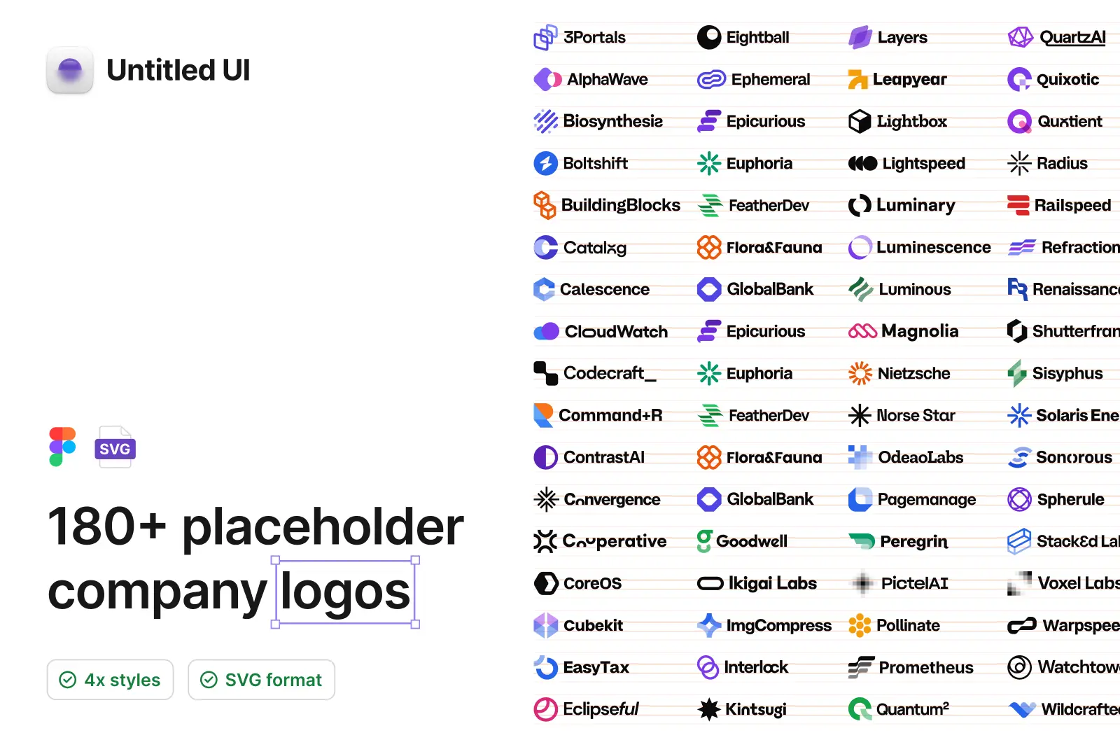
Get the 180+ FREE logos Figma library
We've put together a huge collection of 100% free fictional logos to use in your designs.
Every logo has been painstakingly optically sized proportionally to each other so they line up nicely in your website designs.
These placeholder logos are 100% free to use in personal and commercial projects. You can even use one of these logos for your startup or business!
Publish the Figma file as a library and use across all your projects:
- Duplicate to your Figma account
- Publish your copy as a library
- Enable your library in your files for instant access to placeholder logos!
Join our affiliate program

