


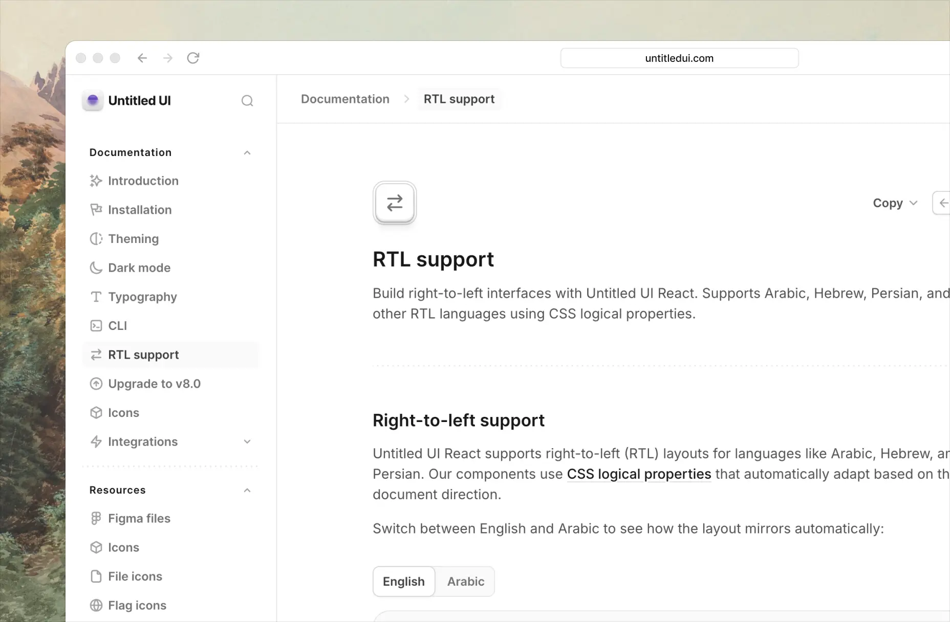
Right-to-left (RTL) support
Untitled UI React library now supports creating RTL-ready layouts.
This is an optional feature you can opt-in to easily if you want to support RTL in your application. Check out our RTL migration guide to learn how.
Untitled UI React library now supports creating RTL-ready layouts.
This is an optional feature you can opt-in to easily if you want to support RTL in your application. Check out our RTL migration guide to learn how.
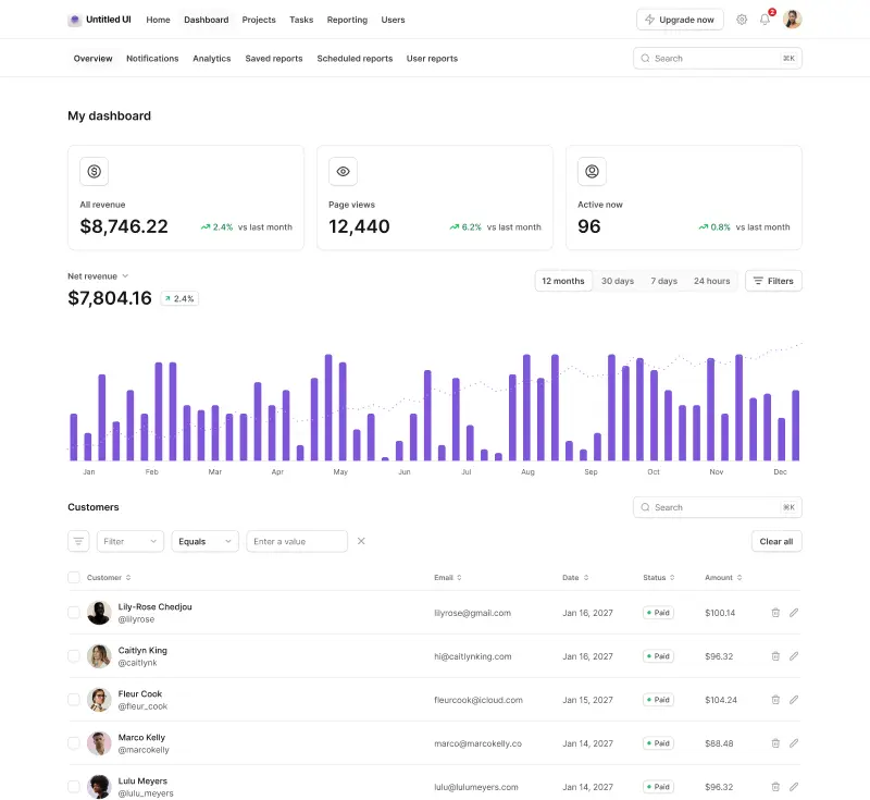
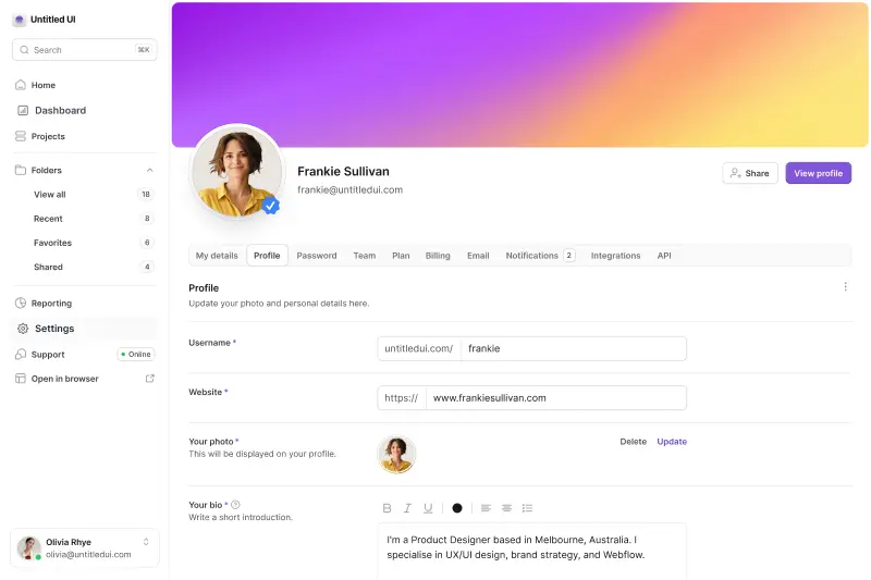
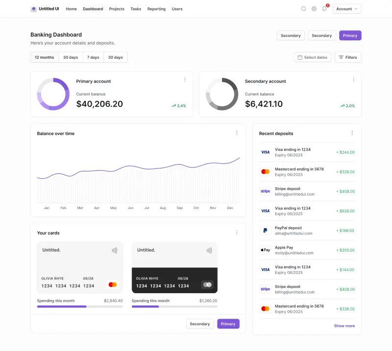
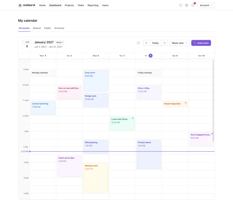
With Untitled UI v8.0, we focused on refining the entire library: improving core components, filling gaps in the system with new components, and tightening overall quality and consistency.
This update has laid the foundations for a planned release cadence. As always, we’re focused on continuous improvements and updates to Untitled UI as we use it in real-life projects in pursuit of the “perfect” design and code library.
We won’t cover every pixel, but here are some highlights:
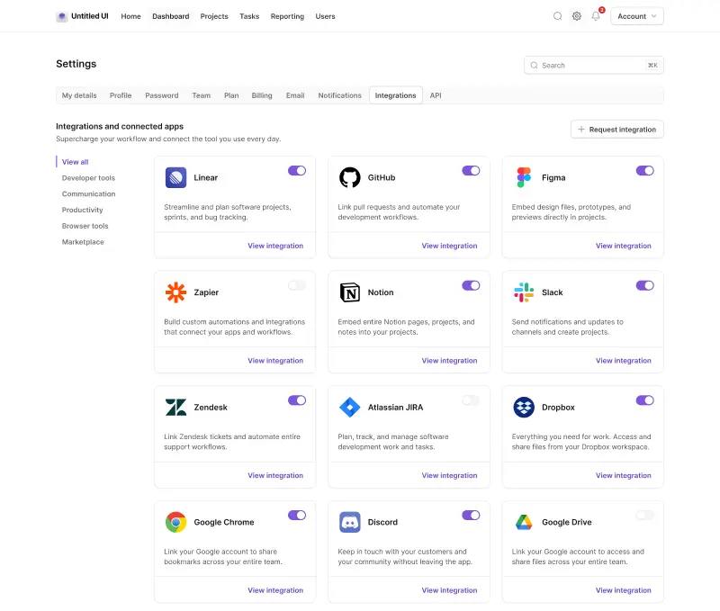
Other updates
All of these updates and improvements are included for free in both Untitled UI React and Untitled UI Figma, including all three versions of the Figma UI kit:
Please sign in using the email address you used to purchase Untitled UI to access updates. We've also published detailed upgrade documentation for Untitled UI React to make moving from v7.0 to v8.0 as smooth as possible.
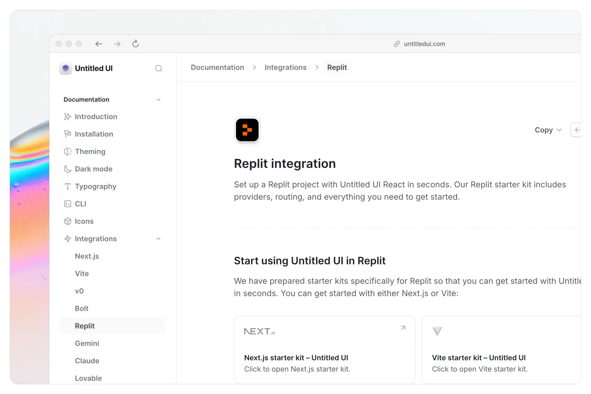
Untitled UI React can now be used directly in Replit projects. Start building interfaces quickly using our CLI and component library inside the Replit development environment.
This makes it easy to experiment, prototype, and build full applications with Untitled UI React directly in the browser.
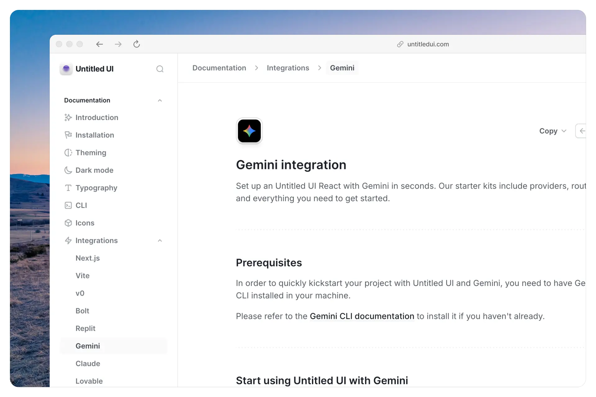
You can now use Untitled UI React with Gemini with our new Gemini integration.
Our Next.js and Vite starter kits include everything needed to get started, including providers, routing, and a GEMINI.md file that gives Gemini context about the component library so it can generate and compose UI using Untitled UI components.
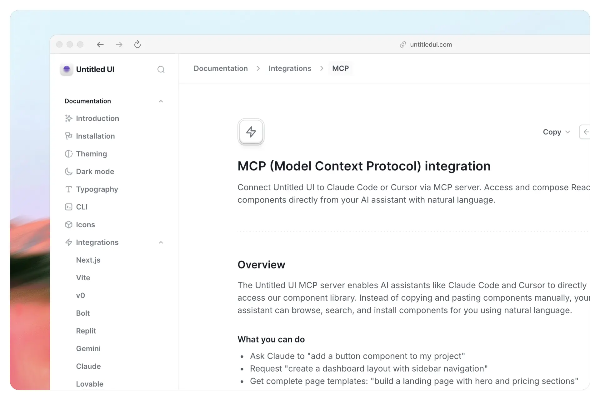
We’ve added support for our MCP server, allowing Untitled UI to connect directly with AI tools like Claude Code and Cursor.
Your AI assistant can browse the component library, search for components, and install them into your project using natural language.
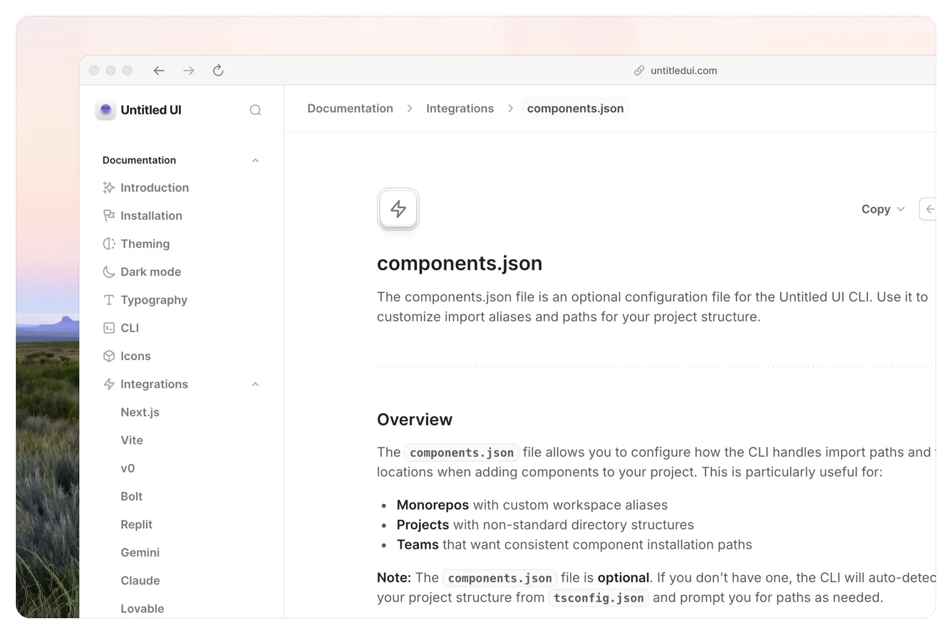
Untitled UI now supports components.json configuration for projects using the CLI. This allows the CLI to understand your project structure, including component directories, path aliases, and install locations.
The CLI can also automatically create and configure a components.json file when setting up a project, ensuring components are installed in the correct location with the right configuration from the start.
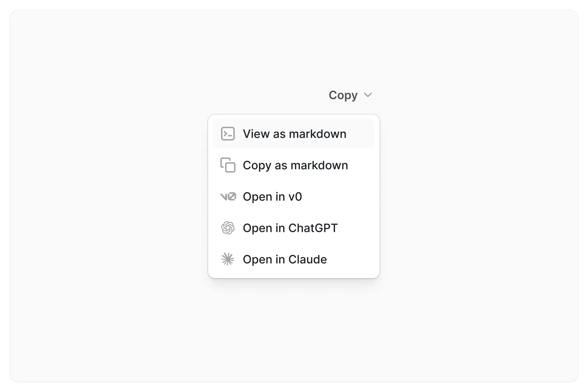
Use the new Copy as dropdown to copy React components and layouts as markdown. You can open them directly in v0, ChatGPT, or Claude to generate or modify interfaces with AI.
This makes it easier to work with Untitled UI components inside modern AI coding tools. Support for more AI tools is coming soon.
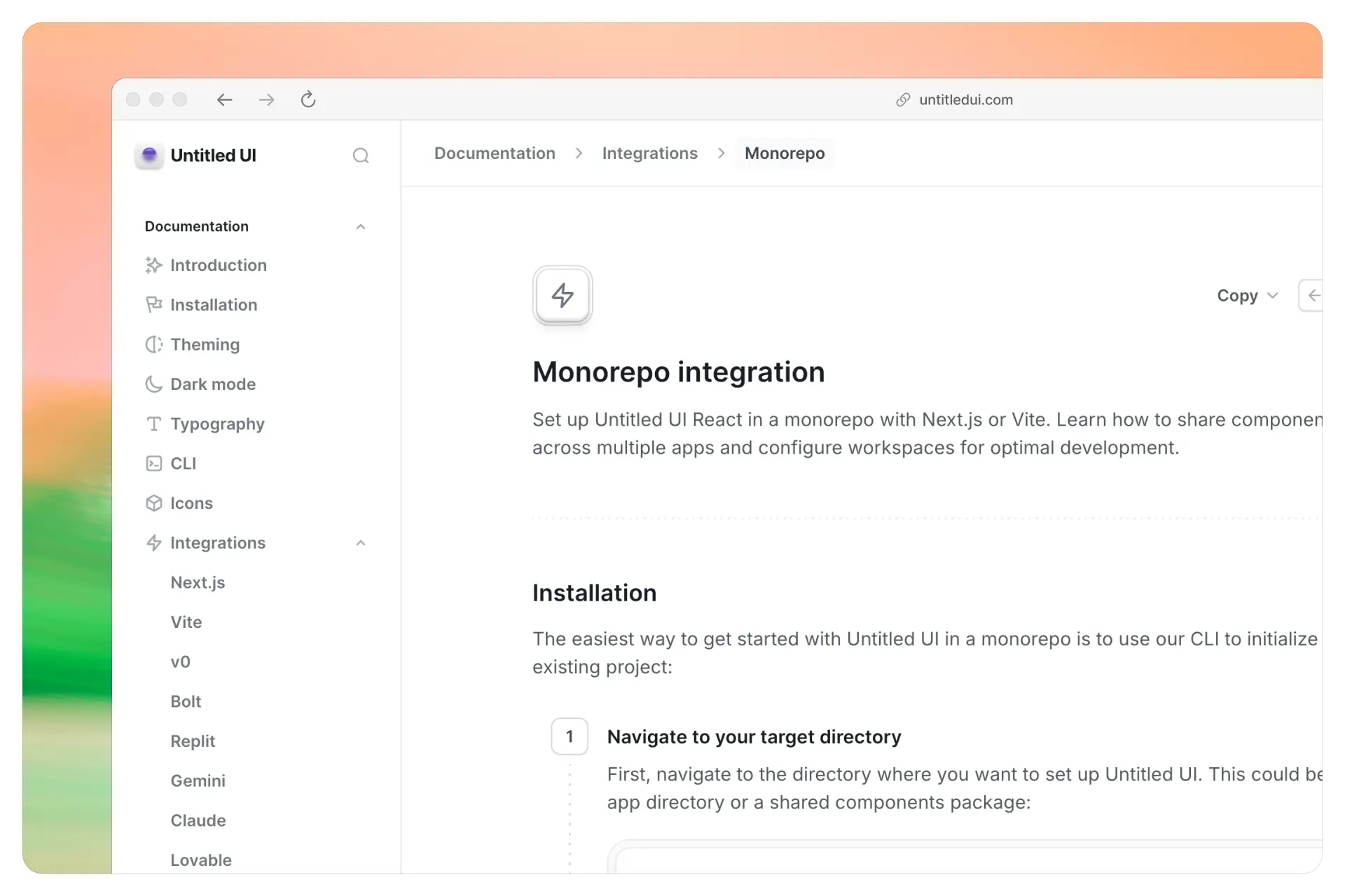
Untitled UI React now supports monorepo project setups. You can initialize and install components inside shared packages or app directories within your workspace.
The CLI reads your components.json configuration to understand aliases and workspace structure, making it easy to share UI components across multiple apps in a monorepo.
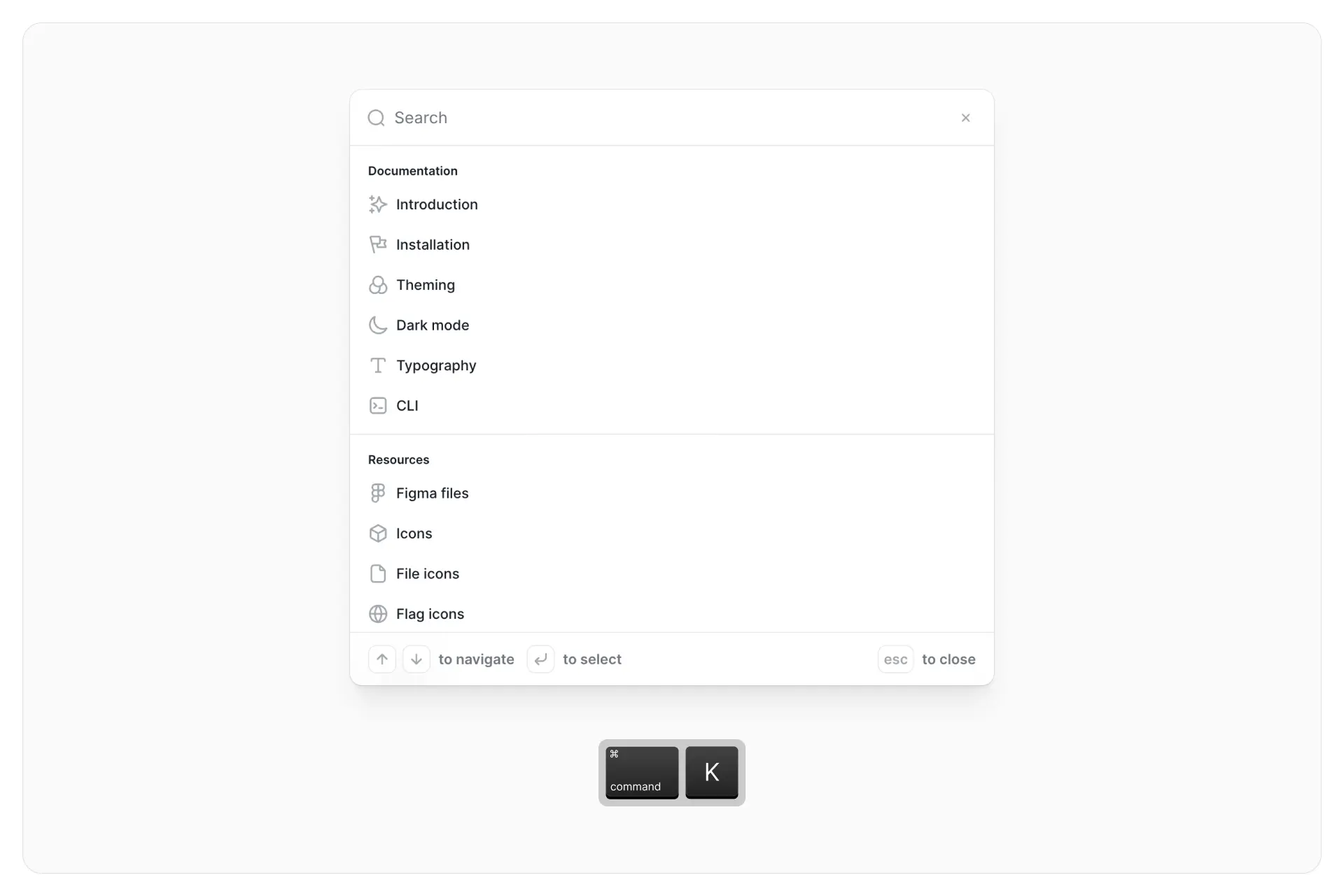
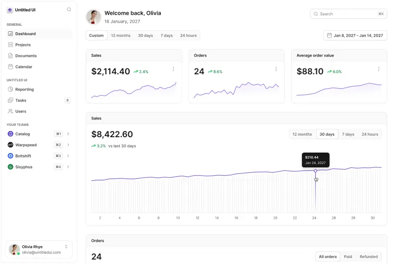
We’ve upgraded the search and navigation experience in Untitled UI React:
As always, we’re focused on continuous improvements and updates to Untitled UI as we use it in real-life projects in pursuit of the “perfect” design and code library. We're working on some much bigger updates behind the scenes and will have more announcements soon!
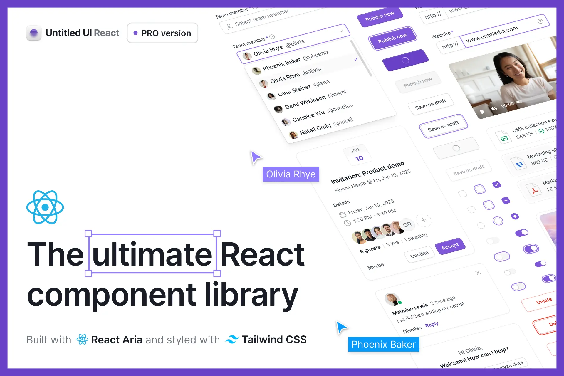
Untitled UI React is the world’s largest collection of open-source React components built with Tailwind CSS and React Aria. Just copy, paste, and build.
Skip months of design and development with pixel-perfect, production-ready components. Untitled UI React is built with React Aria and TypeScript v5.8, and styled with Tailwind CSS v4.1. It's the perfect starting point for any project, no matter the size.
We've made a huge part of Untitled UI React free and open source. Use our free components in unlimited commercial projects—no strings attached.
Untitled UI React isn't just a collection of basic components like most React component libraries. It's consistent, professionally designed, and includes everything you need to design and develop modern, beautiful interfaces, web apps, and websites in one neatly organized package.
Here’s what sets Untitled UI React apart:
Too many React component libraries lack in size, scalability, consistency, or quality—usually all three. We couldn't find a React component library we loved, so we built the biggest one in the world.
Check out our documentation and explore our free components to get started.
Untitled UI React components are built with and powered by:
We’ve kept our tech stack minimal, so you can focus on building instead of wrestling with dependencies. You own the code, so you can build and extend without relying on third-party maintainers.
We're always working to make Untitled UI better than ever, including implementing new updates into our products as fast as possible. All Untitled UI products come with free updates for life.
We’ve added React support and official npm packages for Untitled UI Icons! Instantly install, import, and style Untitled UI Icons as React components.
You can now instantly install, import, and style icons as React components. Plus, copy any icon in SVG or JSX format directly from the new Untitled UI Icons resource page.
If you’ve purchased the PRO version of Untitled UI Icons, you can unlock additional styles by configuring your package manager with your private access token. Sign in to Untitled UI for setup instructions.

This update includes many new components and significant improvements to existing core components, including buttons, text editors, and tables. As always, we’re focused on continuous improvements and updates to Untitled UI as we use it in real-life projects in pursuit of the “perfect” design library.
We won't cover every pixel, but here are the main updates:
All of these updates are included for free in all three different versions of Untitled UI:
In case you missed it, we’ve also created some new pages on the site so you can quickly copy useful design assets from Untitled UI right into your design projects:
We’re actively working on improving these pages and will be releasing even better versions soon. Please share them on X (Twitter) if you find them useful! They’re 100% free to use in personal and commercial projects, even if you’re not a customer of Untitled UI.

In version 5.0, we updated Untitled UI to support Figma’s new features released at Framework 2024 and Config 2024, rounding out color variables and introducing Figma’s new typography and effects variables.
Today, we've released Untitled UI v6.0, a different kind of update. This shiny new version of Untitled UI includes a new and refined default color palette, hundreds of new and improved components, and countless small but significant changes we’ve wanted to make for some time.
Unlike the last few updates which mainly focused on introducing variables (boring), this update is one that we’re excited about and enjoyed building.
As always, we won't cover every pixel, but here are the main updates:
All of these updates are included for free in all three different versions of Untitled UI:
Untitled UI’s v5.0 default gray color palette was slightly blue saturated, giving it a “cooler” feel. This is a common approach, particularly in B2B and SaaS because it works well with “cooler” colors such as blue, indigo, and purple (e.g. Stripe).
With the release of Untitled UI v6.0, we switched the default gray color palette to a less saturated “flat” gray, for a clean and modern look and feel:

This new gray color palette is more neutral with less blue saturation, making it easier to work with regardless of your project and your brand colors.
After using Untitled UI in dozens of different projects and creating 1,000+ daily design posts, we often found ourselves reverting to the Gray neutral, Gray iron, and Gray true alternative color palettes included with Untitled UI, all of which are desaturated.
The new gray color palette is more aligned with our long-term goal for Untitled UI: to be the perfect starting point for any project. It’s neutral, clean, and just “works”, regardless of what you’re working on.

Of course, if you want to revert back to the gray color palette used in Untitled UI v5.0, just edit your color variables or styles in your file to the following:
You can find a step-by-step guide on how to change your color palette inside the Figma files under FOUNDATIONS>Colors>Notes and documentation.

We've released v5.0 of Untitled UI to support Figma’s exciting new features released at Framework 2024 and Config 2024. These updates include support for typography and effects variables, meaning variables are officially out of beta.
Typography variables allow you to define values such as font families, font weights, font sizes, and line heights and apply them consistently across your entire system. We’ve updated the Untitled UI to include these new typography and effects variables.
We also made significant improvements to core components, focus states, and effects styles, and added a bunch of useful new components and assets!
As always, we won't cover every pixel, but here are the main updates:
All of these updates are included for free in all three different versions of Untitled UI:
Many elements in Untitled UI, including buttons and featured icons, have recently been updated with a subtle skeuomorphic style.
Skeuomorphism incorporates depth, shadows, and textures to simulate the physical world, making components like buttons more “real” looking and visually engaging. We’ve intentionally kept this effect as minimal and subtle as possible.
Here’s an example with buttons:

Skeuomorphic design was popular in the early days of digital interfaces, especially with the introduction of Apple iOS. Over time, UI and web design have shifted towards minimalism and flat design.
Recently, skeuomorphism has made a noticeable comeback. Is it a trend? Yes, but so are many visual decisions in UI design. As long as accessibility fundamentals are maintained, we’re all for it.
As you can see in the example above the skeuomorphic effects we’ve added are extremely subtle and simple. They are achieved with a couple of shadow effects:

If you prefer the flat style of Untitled UI v4.0 buttons, it’s incredibly easy to remove skeuomorphic effects from your buttons and components. We’ve set it up that way.
These effects are set up as individual effects styles. Just change the effect style at the master component level to add or remove skeuomorphic effects:

You can even delete the shadow-xs-skeuomorphic effect style if you don’t need it!
Another major visual update to Untitled UI is a new “focus” and “active” state style:

A focus ring (also known as a "focus indicator") identifies the currently focused element on your page. Focus rings are important for accessibility when providing interfaces for users who are unable to use a mouse. Focus rings act as a stand-in for their mouse pointer.
The new focus state style is much more noticeable, switching from your brand-100 color to brand-500. We decided on this update for a few reasons:

Our Untitled UI FREE UI kit has hit 100,000+ downloads! We've been blown away by the support for this project and are always making improvements to the PRO version.
To celebrate, we've made some improvements and updates to the free version of Untitled UI for the first time since we launched it back in 2021.
The free version of Untitled UI is essentially a slimmed-down version of the full UI kit. It includes global styles, basic components, and a few page examples. The majority of changes are subtle aesthetic and accessibility improvements:
The free version of Untitled UI is based mainly on v2.1 and doesn’t include Figma’s latest features announced at Config 2023, including color variables (dark mode), spacing and radius variables, Auto Layout 5.0, min/max widths, Auto Layout wrapping, and much more.

Dark mode is here! This is our biggest update yet.
We’ve completely refactored Untitled UI to support Figma’s latest features announced at Config 2023, including color variables (dark mode), spacing and radius variables, Auto Layout 5.0, min/max widths, Auto Layout wrapping, and much more.
As always, we won't cover every pixel, but here are the main updates:
There’s more. You now have access to three different versions of Untitled UI, depending on your project or how you prefer to work:
As we mentioned, we’ve split the Untitled UI PRO into three different versions:
Why? This was a pragmatic decision so you can choose which system works best for your workflow or project. Designers and teams should feel empowered, not overwhelmed. If you aren’t using design tokens or variables already in your projects, it can be easy to feel overwhelmed.
If building and maintaining 3x versions of the same file sounds like an insane amount of work, please know that it was! However, we firmly believe using variables is not the best approach for everyone. It’s okay to continue using styles if you want to — we’ll dive into this more below.
We will continue to update a non-variables version of Untitled UI for the foreseeable future so you can continue to work with styles if you prefer to. It’s just as up-to-date with all the other new features announced at Config 2023.
Similarly, we first introduced PRO LITE way back in v2.6 as a premium and lightweight version of the full Untitled UI PRO STYLES kit. It's 55% lighter, and faster, and is designed to include everything you need and nothing you don't. It's perfect for moving fast and for smaller projects and is an incredibly powerful UI kit in its own right.
Variables are an exciting and powerful new feature in Figma. They bring another level of functionality, scalability, and flexibility to an already incredible design tool and bridge the gap between design and development even further.
The most commonly asked question we get from designers is, “Do I need to use variables?”. The answer is no. You don’t have to if you don’t want or need to.
It’s easy to get caught up in shiny new tools and design tokens have been one of Figma’s most anticipated features. However, implementing, managing, and using variables brings another level of complexity to the design process and your design projects. Adding, editing, and applying variables in Figma is more time-consuming than using styles. Anyone who tells you otherwise hasn’t used them in real projects.
The way we think about it is this; if you’re a large team, you’re already using design tokens in your design to development workflow, or absolutely need to have dark mode for every component and layout, then it probably makes sense to invest the time and effort to implement and use variables, just like it would make sense to use tokens in development.
If you’re a solo operator, a small team, have a simple product, want to move as fast as possible, or simply don’t care too much for dark mode (hint: not every product needs dark mode), sticking with styles probably makes more sense! At least for now. Don’t feel like you need to use variables simply because it’s a brand new feature.
Another important thing to consider is that variables are still in open beta, which means they’re still ironing out bugs and are adding more functionality (more on this below).
The decision whether or not to use variables is entirely up to you. This is one of the reasons we released different versions of Untitled UI 4.0 — one using variables and one using styles. Try them both and see which suits your workflow better!
Perhaps the second most commonly asked question we get from designers is, “With variables, should I still use styles?”. Right now, the answer is, “We’re not sure, so keep them for now.”
The main reason this is the answer is because it’s directly from Figma’s team. Styles in Figma are still useful because they can reference multiple values at once, while variables only support one raw value. Also, styles support gradients and effects, while variables don’t yet.
It’s not clear yet how the relationship between styles and variables will evolve over time and over the course of variables beta. Styles still have their purpose for now and you should keep them in your files. The good news is that if you’re using variables, you can reference those variables in your styles so your variables act as the single source of truth.
If you’re new to variables, we suggest reading through the ❖ Variables documentation page included in the file. We cover everything from how to learn variables, how variables work within Untitled UI, why we made specific decisions, plus best practices and mistakes to avoid when using variables in your projects.
Because variables are so new, even the Figma team are still figuring things out. There are no defined industry standards and there isn’t a lot of practical documentation or best practice guidelines on how to use variables effectively.
It’s important to note that variables were introduced at Config 2023 and are still in open beta. This means it has plenty more room to grow and evolve as the Figma team iron out any bugs and add missing features.
We’ve been working hard to incorporate all the available features into Untitled UI but keep in mind that there are still some key features and functionality missing from variables that will likely be introduced soon. We’ll incorporate these into Untitled UI as quickly as possible.
If you’re on the fence about whether to switch to using variables yet or wait until this feature is out of beta, these are some key missing features to be aware of:
This is the most obvious missing feature from variables. Currently, you cannot use and apply variables to certain key properties in designs including:
This is the most obvious missing feature from variables. Currently, you cannot apply variables to certain key properties including stroke widths, effect colors (shadows etc.), layer opacities, independent radius values, and more.
Figma are exploring how they want to support typography variables. Typography variables will likely provide you with a way to easily switch key typography properties across modes such as typefaces and sizing.
For example, you may want to set up typography scales to dynamically switch between breakpoints in your designs.
Figma have noted that this will be an enterprise-only feature, but soon Figma will support extended collections. This will provide teams with a way to handle theming for sub-brands with brand-specific overrides.
Thanks for reading this far! We’re excited about these 1% incremental improvements and we’re already working on the next update. Stressing these small details compounds over time.
Variables is still in open beta so we’re expecting more changes and updates soon. We’ll do our best to implement improvements into the system as soon as possible.
In other news, Untitled UI turned 2 years old last week! I truly appreciate the overwhelming support for this li’l side project. I genuinely love working on it and look forward to dedicating more time to it.
We've added keywords to all icons for faster searching!
Ever tried to search for an icon but can't remember the exact component name? We've made life a little easier by adding super-smart keywords to every single icon in both the free and PRO icon libraries.
As you may know, Figma allows you to to add descriptions to components. Descriptions are useful for providing tips for using particular components for your team or adding important dev notes and links to documentation. What you may not know is that these descriptions can act as tags for better searching.
For example, say you're looking for a file icon, but can't remember what it was called. Was it called file, attachment, text, paper, pdf, or report? Now you can search any of these.
This is a small update, but one that will hopefully save you a bit of time. As always, we’re excited about these 1% incremental improvements. Stressing these small details compounds over time.
We’re already working on the next update for Untitled UI after Config 2023 which will also include icon keywords. Stay tuned!
You can download Untitled UI Icons v1.6 by clicking the link in your original receipt email. Check out our guide on how to do this on our FAQs page (click the Untitled UI Icons tab).

We’ve made some updates to Untitled UI PRO and PRO LITE!
Quite a lot. We initially planned on simplifying and improving existing components and releasing this update in early April. We got a little carried away with adding shiny new things and stressing tiny details.
As always, we won't cover every pixel, but here are the main updates:

We've made some updates to Untitled UI PRO and (re)released Untitled UI PRO LITE. Everyone who has purchased PRO has free access to PRO LITE.
Untitled UI PRO LITE is a premium and lightweight version of the full Untitled UI PRO kit. It's 55% lighter, faster, and is designed to include everything you need and nothing you don't. It's perfect for moving fast and for smaller projects!
If you were an early supporter of Untitled UI, you may remember we initially released PRO LITE back in February. When Figma unveiled their new component property features we completely refactored Untitled UI PRO, simplifying and reducing almost every component. This made the first version of PRO LITE a bit redundant.
We've found some time to revisit this idea and have built an even better PRO LITE with Figma's new features.
We've kept the most useful components and removed the rest. The result is 55% fewer overall layers.
Both kits include almost identical foundational components and styles but have far fewer variants and additional components across the rest of the kit. We've also slimmed down the page examples.
Even though PRO LITE is 55% smaller than the full PRO version, the new PRO LITE kit is an incredibly robust and powerful UI kit in its own right. It's still more comprehensive and better value than other kits we've seen.
We're always looking for ways to improve Untitled UI. We spent weeks creating a lightweight little brother to the full PRO version so you now have two options: start with the complete PRO version or ship faster with the PRO LITE version.
We won't cover every tiny detail, but here are the main updates:

We've released an update to Untitled UI.
This update is a little different from previous releases... but it's one we've wanted to do for a while. While there are a few new components as always, the majority of changes are subtle aesthetic and accessibility improvements.
We won't cover every tiny detail, but here are the main updates:

We're excited to share something we've been working on for the last few months. We've launched an official Untitled UI Webflow component library!
Copy 275+ fully-responsive website components and paste them straight into your Webflow projects. We're adding new components regularly and the entire library is built using Finsweet Client-first best practices.
We teamed up with the Relume team for this launch. They've just released Relume Library 2.0, which allows the Webflow community to create and share their own Webflow component libraries. This is on top of the world's largest Webflow component library!
We put a lot of love and work into this. It would mean a lot if you could please take a second to support the launch on Product Hunt.
You can check out the Untitled UI Webflow Library on our Relume Library profile.
Try it out for free and copy fully-responsive website components straight into your next Webflow project.
Not yet! We've launched with the most useful 275+ marketing site components which was a huge amount of work. We'll be adding new components to the library regularly.
Relume Library is the world's largest Webflow component library. Copy 800+ unstyled components with one click and paste them into your Webflow project.
They've just released Relume Library 2.0, which allows the Webflow community to create, save, and share their own Webflow component libraries.
Finsweet Client-first is a set of guidelines and strategies to help you build Webflow websites in a clear, organized, and scalable way that any human can understand.
Clients, marketers, Webflow developers, and anyone who opens your Webflow project should be able to read a class name and understand what that class is responsible for doing. Our components are built using Client-first, so you know you're using best practices for your Webflow builds.
If you haven't used Client-first before, it's a game changer and easy to learn! Once you start using it, you won't turn back. Check out the Client-first documentation to learn more.
Learn more abut how this works on our FAQs page.

We're excited to share something we've been working on for the last few months! Untitled UI Icons are a clean, consistent, and neutral icon library crafted specifically for modern UI design. Made for Figma, in Figma.
We've also released a FREE version of the icon library at untitledui.com/icons. You can use the icons in unlimited projects!
We've completely replaced the default ~280 Feather icons in Untitled UI with our new library. You'll now find 1,100+ high-quality, neutral, and consistent icons to choose from.
We searched everywhere for the "ultimate" icon set for modern UI design to use across all our projects... We couldn't find an icon library for Figma we loved so we made one.
Just a quick update — we've added a new solid icon style to Untitled UI Icons!
You'll now find 1,100+ brand new solid icons included in Untitled UI Icons. These solid/fill style icons were requested by a few people on Twitter. They're handy in UI design when you need a high-contrast icon style to stand out even more.
We also changed all fill and stroke colors to currentColor for faster implementation. This means you can use the exported SVGs or copy them from IconJar directly in projects and they'll automatically adapt to the color you're already using in your CSS. Learn more about how currentColor works in CSS.
You can download v1.5 by clicking the link in your original receipt email or via your Gumroad library if you made an account.

Figma announced some great updates at Config 2022 last week, particularly around auto layout and component properties. We've been working non-stop since to make Untitled UI even better than ever.
To make the most of Figma's new features, we've completely refactored the entire library. Almost every single component has been simplified and improved upon, making it the biggest update to Untitled so far. Was this a lot of work? Yes. But we're really excited about the changes Figma are making and we're already working on v2.8.
We were halfway through this update when these new features were released, so you'll also find a bunch of useful new components and expanded existing pages. We've also got another announcement further down...
As we mentioned, almost every single component has been changed so we won't cover everything but here are a few points. Firstly, the entire library has been simplified and improved with the new boolean component property features, drastically reducing the number of variants without losing any of the functionality. A few highlights:

We have some great news for you all! We’ve released a new update to Untitled UI which includes a brand new lightweight version called Untitled UI PRO LITE.
Everyone who has purchased Untitled UI PRO now has free access to PRO LITE with free updates for life.
Untitled UI PRO LITE is a premium and lightweight version of the full Untitled UI PRO kit.
It's 50% lighter, faster, and is designed to include everything you need and nothing you don't. It's perfect for moving fast and for smaller projects! You can preview PRO LITE at untitledui.com.
Even better, if you move the example pages to a separate file, PRO LITE is 70% lighter than the full kit!
We hope that it will come in handy next time you have a smaller project or a tight timeframe. Plus, we want to say thanks to everyone who has bought Untitled UI so far by including it for free with this update.
We're always looking for ways to improve Untitled UI. We spent weeks creating a lightweight little brother to the full PRO version so you now have two options: start with the complete PRO version or ship faster with the PRO LITE version.
Even though it's ~50% smaller than the full PRO version, the new PRO LITE kit is an incredibly robust and powerful UI kit in its own right. It's still more advanced and better value than anything else we've seen.

We’re excited to announce that we’ve released a new update to Untitled UI! 🤗
The main improvement is by far the most requested: interactive components. We’ve added hover and click interactions, helping you to quickly create prototypes that feel like the real experience.
If you haven’t used Figma’s prototyping feature before, check out this tutorial.
