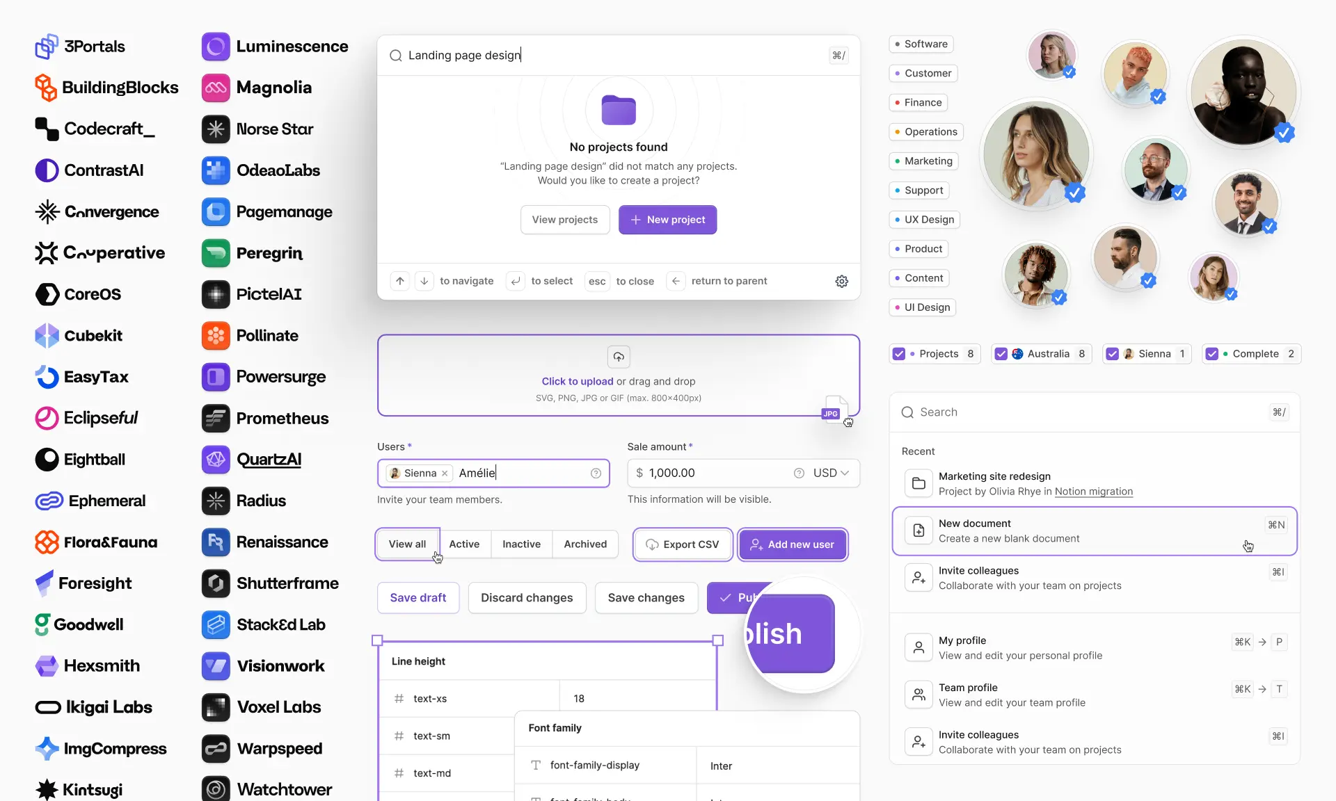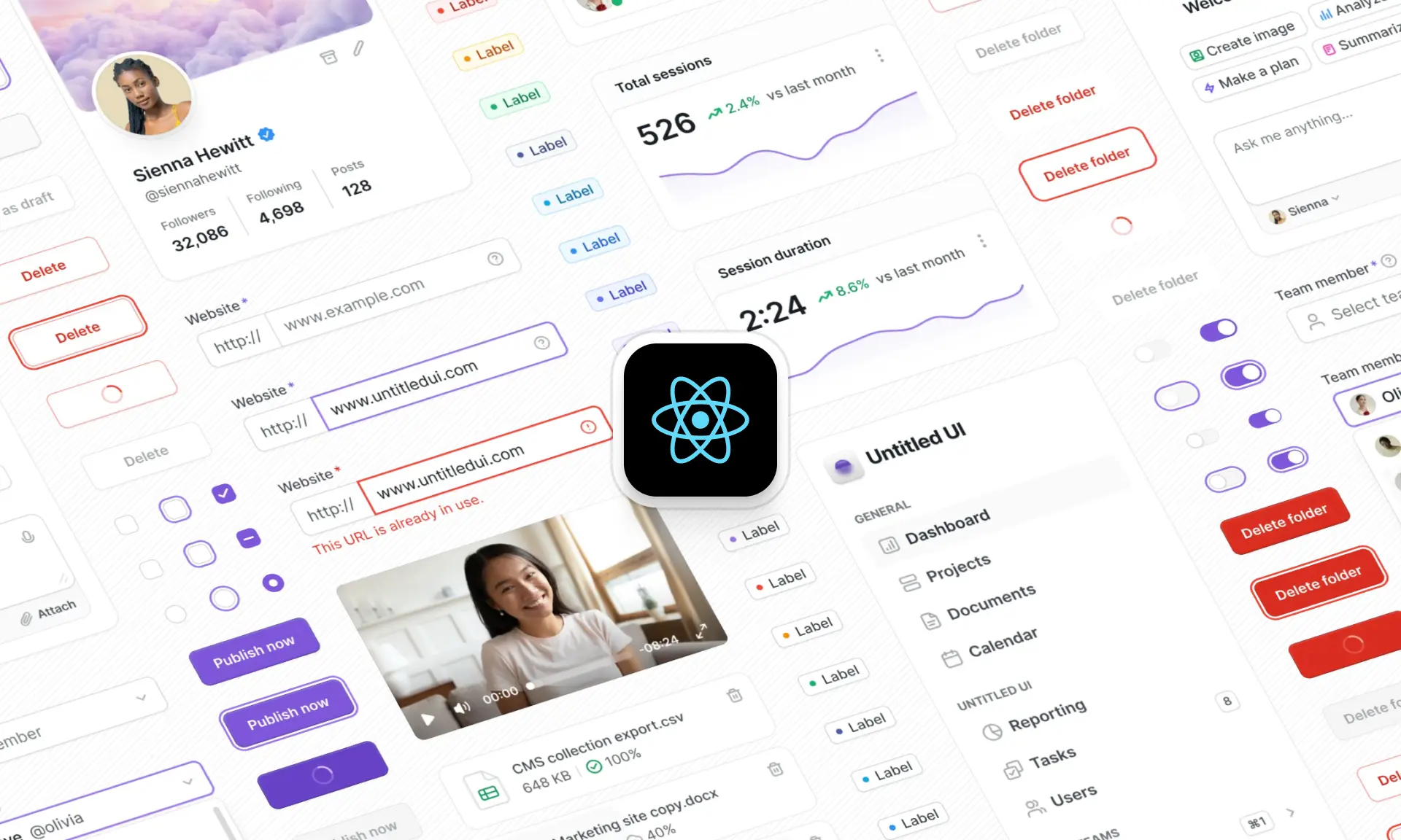
In modern web development, speed and consistency are everything. Instead of reinventing the wheel, React UI component libraries give developers customizable pre-built components and layouts, with accessibility best practices built in.
These React component libraries don’t just save time; they improve code reusability, enforce design consistency, and help teams ship polished, accessible interfaces and React applications faster.
What is a React UI component library?
A React UI component library is essentially a collection of reusable UI elements and pre-built components — the building blocks of a modern interface — packaged with styling, behavior, theming, and accessibility best practices. By using these components as a foundation, developers can spend less time building every component from scratch and more time building unique features that matter to end users.
Building from scratch is expensive, so investing in a reliable UI component library early can save countless hours and thousands of dollars. By leveraging React libraries and pre-built components, developers and teams can instantly improve:
- Consistency: Maintaining a uniform look and feel across your app and design system not only improves the developer experience but also leads to a better user experience.
- Speed and productivity: Using an extensive React library with pre-built components can drastically speed up the development process because developers aren't building every component from scratch.
- Best practices out of the box: Modern essentials and key features like accessibility, TypeScript support, responsive layouts, Tailwind CSS styling, and dark mode/theming are already included — a big step up from older libraries like React Bootstrap. Modern React libraries also integrate seamlessly with animation tools like Framer Motion.
- Maintainability: A well-architected React library keeps components easy to update and consistent across your project.
- Scalability: All types of React applications can benefit from leveraging pre-built components. Maintaining a scalable design system becomes even more important in large enterprise applications.
What to look for in a React UI component library
In 2026, expectations are higher. Developers now demand good TypeScript support, first-class WCAG accessibility, dark and light mode theming, server-side rendering compatibility, and top-tier performance across a wide range of applications. Most modern libraries deliberately stay out of state management, leaving you free to pair components with Redux, Zustand, or plain React Context. Most of these libraries are also routing-agnostic, so they pair cleanly with React Router or your framework's built-in router (Next.js, Remix). Whatever your state management approach, keeping it decoupled from the UI layer makes it easy to swap libraries later without a full rewrite.
Here are a few more key features to keep an eye out for in a modern React UI component library:
- Accessibility: Accessibility isn’t optional; it’s a legal requirement in some regions and a baseline expectation for any serious product. Every component library on this list prioritizes accessibility, but some (Untitled UI React, shadcn/ui, React Aria) go further with WCAG compliance baked in.
- TypeScript support: With the rise of open-source tools and modern workflows, strong TypeScript support is now essential. It improves developer experience, reduces bugs, and makes React libraries far more appealing to React JS developers and teams working on enterprise applications.
- Theming: A great React UI component library should support dark mode and make it easy to deliver a polished React application that adapts seamlessly to brand guidelines without forcing developers to wrestle with low-level code. Good theming means less time spent customizing React UI components and more time building.
How we chose the best React UI component libraries
There are hundreds of React UI component libraries available today, with new libraries launching every week. When we were building Untitled UI React, we spent months researching React UI component libraries and UI kits.
We didn't write this post to be the most comprehensive list of every React library under the sun. Instead, we've written this post to highlight the best modern React UI component libraries in 2026 that nail key features and design best practices. We'll also be updating this blog post regularly with new React libraries.
We used a clear set of criteria to decide which libraries to include:
- Active maintenance & community support: React UI component libraries that are outdated, abandoned, or rarely updated with modern tech stacks were excluded. We prioritized projects with strong communities, frequent updates, and long-term support signals.
- Modern tech stack: Best practices such as TypeScript support, server-side rendering (Next.js, Remix), routing (React Router), and React v18+ compatibility are important for a good developer experience. For example, React Bootstrap, Semantic UI React, and Fluent UI are some of the earliest and oldest React libraries, but their reliance on older paradigms and limited TypeScript support make them less suitable for modern React applications. We also left off React Suite for similar reasons — it's still maintained, but its component API and design language haven't kept pace with 2026 expectations. If you're currently maintaining a project built on an older library like Semantic UI React or Fluent UI, migrating to one of the modern options above is usually a worthwhile investment.
- Accessibility standards: Accessibility best practices (such as WCAG, WAI-ARIA) aren't optional in modern web development. We selected libraries that either bake in accessibility by design (React Aria, shadcn/ui, Untitled UI React) or provide clear guidance to developers on building accessible UI components, interfaces, and websites.
- Theming & customization: A modern React UI component library should make it quick and intuitive to align components with your brand and existing design system with minimal effort, including support for dark mode.
- Performance & scalability: The best React UI libraries are lightweight, ship with optimized bundles, and offer a comprehensive set of components built for real-world applications.
- Design system alignment: Lastly, we prioritized React UI libraries that fit naturally into modern design system workflows. This matters most for teams building custom design systems from scratch, not just picking a pre-styled kit. This includes seamless design-to-code handoff, well-structured and helpful documentation, Figma UI kit support, cross-platform consistency, and flexibility for scaling.
If you’re looking for the absolute best modern React UI component libraries, look no further. We’ve done an extensive search for the highest-quality React libraries built with modern best practices and compiled them here for you in one place!
Comparison table: The 15 best React UI component libraries at a glance
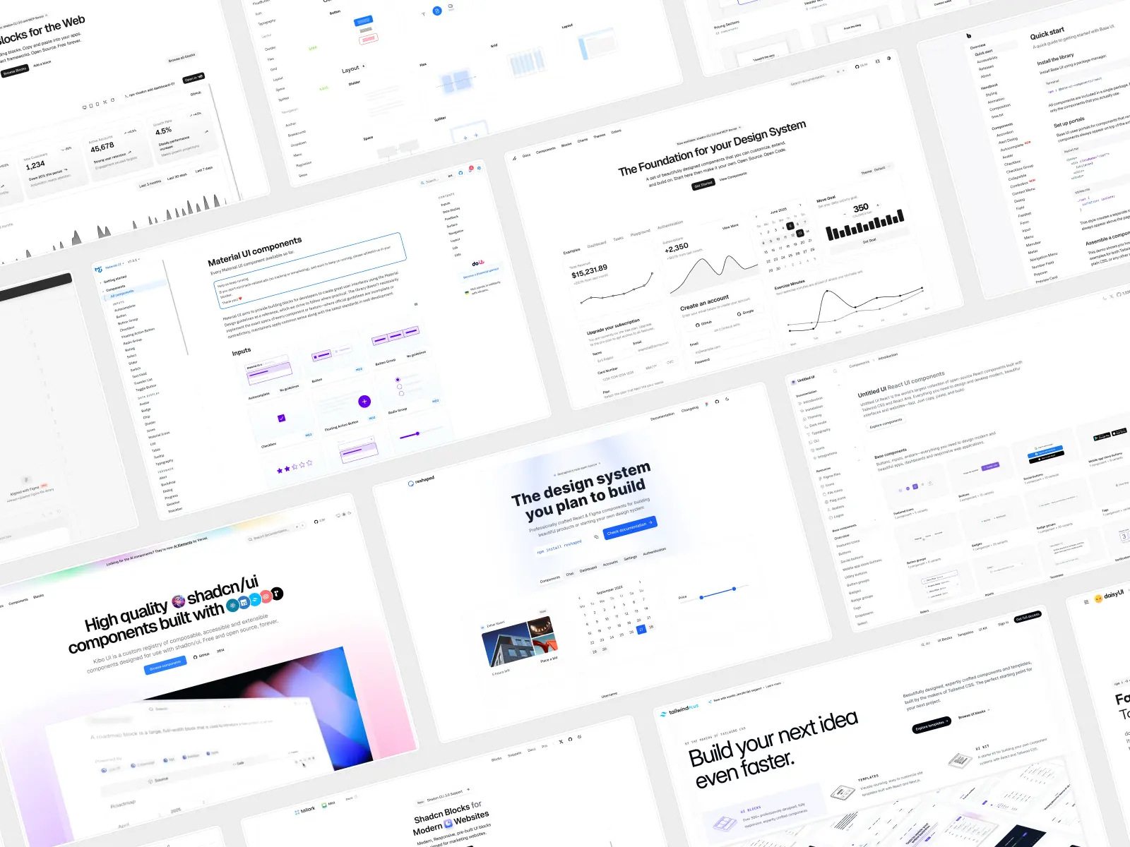
Here’s every library on the list side by side, in the same order as the full reviews below. If you already know what you’re after, this is the fastest way to find it. If you don’t, the reviews underneath cover what each one is actually like to work with.
Okay, let's get into it — here's the full list of the best React UI component libraries:
1. Untitled UI React
untitledui.com — Open source + paid from $349 (lifetime access)
★1.9k · npm (CLI): ~8.9k/wk
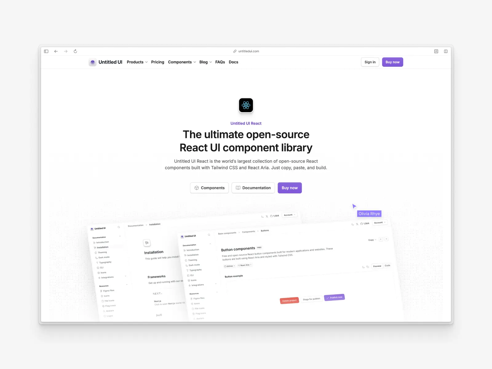
Untitled UI React is the world’s largest collection of open-source React components built with Tailwind CSS v4.3, React Aria, and TypeScript v5.9.
Launched recently, it’s one of the newest component libraries on this list and was built to follow modern best practices and take advantage of the latest new features in React and Tailwind CSS. This library includes all the key features and production-ready components developers expect from a modern React UI component library and even a custom CLI tool.
Untitled UI React is built on Untitled UI Figma, the world's largest and most popular Figma UI kit and design system. This means it comes with clean and modern design by default, and design and code stay in sync with minimal effort (and free lifetime updates).
Untitled UI React key features:
- Designed and built by professionals: A comprehensive collection of accessible, responsive, and production-ready components, crafted with modern best practices for performance, scalability, accessibility, and design consistency.
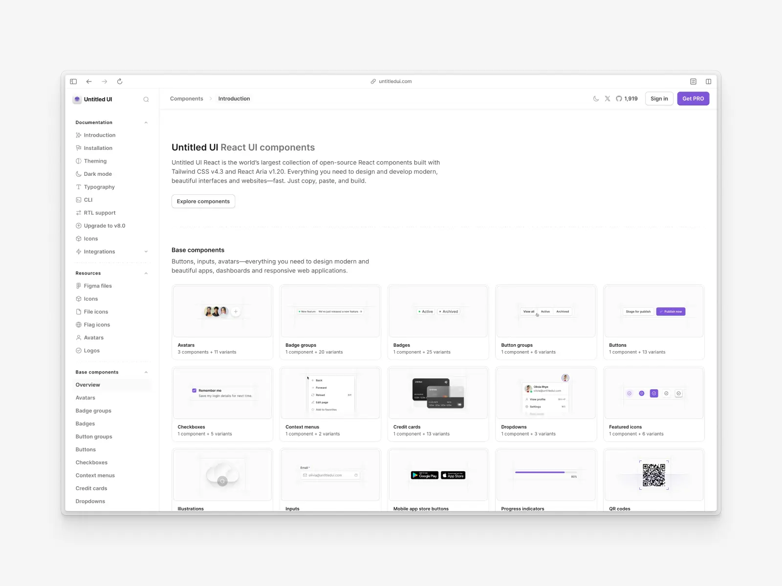
- 5,000+ components: Not just another basic or inconsistent React library, but a comprehensive, growing UI library with 5,000+ Untitled UI React components and 250+ React application and website examples designed to speed up your development process.
- Open-source components: Hundreds of free and open-source React UI components and sections you can use in unlimited commercial projects and applications.
- Unique components: This library includes unique UI components that are not included in other component libraries (e.g. video players, rich-text editors, calendars, and date pickers).
- Styled with Tailwind CSS 4.3: Copy production-ready components built with new features in Tailwind CSS 4.3, including utility classes and dark mode support using Tailwind CSS variables.
- No package dependencies: One of the key features of Untitled UI React is that it doesn't rely on third-party maintainers and external React JS libraries. You own the code, so you can build and extend without relying on dependencies.
- React Aria accessibility and longevity: Untitled UI React is built on React Aria with WAI-ARIA accessibility standards. Unlike other React UI component libraries that are based on Radix UI (which isn't being worked on further), React Aria is actively maintained by Adobe, which ensures scalability, longevity and a consistent API throughout your design system.
- Custom CLI tool and starter kits: Install components or scaffold new projects with a single command, with official installation guides for Bolt.new, Next.js, and more.
- Figma UI kit: All React components are built in sync with Untitled UI Figma, the world’s largest and most popular Figma UI kit and design system. If your development process includes Figma, this means design and code are perfectly aligned.
- Free lifetime updates: If you need additional React components not included in the free version, the PRO version is a one-off cost. Use Untitled UI React components in unlimited projects, forever, with free future updates.
Untitled UI React pros:
- Incredibly comprehensive: The sheer number of React UI components covers almost any use case and specific needs.
- High-quality design: Based on Untitled UI Figma, components are meticulously designed and follow modern design best practices and accessibility standards.
- Excellent for design system foundations: Provides a solid starting point for building a scalable and consistent design system.
- Accessibility-focused: Built on React Aria, ensuring a high standard of accessibility.
- Fully responsive and mature ecosystem: Components look great on all screen sizes, and the library includes additional free resources such as Untitled UI Icons, avatars, and logos.
- Figma UI kit: Based on Untitled UI Figma, the world’s largest and most popular Figma UI kit and design system, so design and code are kept in sync.
Untitled UI React cons:
- Can be overwhelming: The vast number of UI components and scale of this React UI component library might be too much for smaller projects or individual developers.
- Manual updates: Similar to other copy-and-paste libraries such as shadcn/ui, you are responsible for updating the component code.
- PRO version for full access: While Untitled UI React includes hundreds of free and open-source React UI components, some more advanced components and example pages are only in the PRO version.
This library is particularly ideal for teams already using Tailwind CSS and Untitled UI Figma who want production-ready React components out of the box that don't rely on external dependencies and libraries. If you're short on time, here's a 60-second overview:
As we've mentioned, a huge part of Untitled UI React is 100% free and open source. Use the free Untitled UI React components in unlimited commercial projects and React applications to try them out.
Check out the Untitled UI React documentation and explore the free Untitled UI React components to get started.
2. shadcn/ui (Shadcn UI)
ui.shadcn.com — Open source · ★123.5k · npm (CLI): ~8.7M/wk
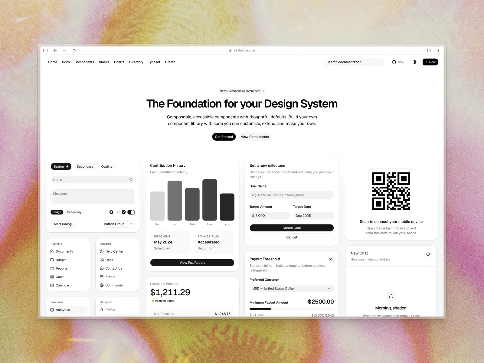
shadcn/ui (also known as Shadcn UI) has a similar approach to Untitled UI React: a set of accessible, beautifully designed pre-built components that you copy+paste into your project rather than consume via a packaged build. It is heavily Tailwind CSS + Radix UI based, giving you large control over styling, behavior, and structure.
The flexibility of shadcn/ui is one of the reasons this UI component library has grown so popular in recent years. In July 2026, shadcn/ui made Base UI the default primitive layer for new projects, with Radix still available as an option and React Aria as a third. Radix itself is no longer actively maintained or being worked on, with around 200 issues still open on GitHub, so Base UI is the safer foundation for new work. This means you can now choose your accessibility foundation at init—a genuinely useful piece of engineering, and one that removes the long-term compatibility questions that used to come with picking shadcn/ui.
shadcn/ui key features:
- Full control: You own the code for every component you use, enabling limitless customization to your specific needs.
- Built with Tailwind CSS: Leverages the power and flexibility of the popular utility-first Tailwind CSS framework.
- Accessibility-first: shadcn/ui components are designed with accessibility in mind, adhering to WAI-ARIA standards with minimal effort.
- CLI for easy integration: A command-line interface makes it simple to add new components to your project. This is one of the new features that modern React libraries are starting to include by default.
- Well integrated with AI tooling: Users of modern AI app builders like Lovable, v0, and Bolt will instantly recognize shadcn/ui, since it forms the foundation for many AI-driven applications.
shadcn/ui pros:
- Full control and ownership: Since you copy the component's code within shadcn/ui, you have the freedom to modify it to suit your specific needs. This is a better user experience for developers, and many modern React UI component libraries have adopted this approach.
- Easy to customize: Easily integrate components and UI elements with your existing design system and branding.
- Lightweight: You only add the components you need to your project, avoiding unnecessary bloat.
- Excellent documentation: Clear and concise documentation makes it easy to get started on your React applications.
- Great community support: While exact users aren’t known, it’s clear that shadcn/ui has become one of the most popular React component libraries, with tens of thousands of GitHub stars and many supporting React UI libraries popping up, such as Kibo UI and Tailark.
shadcn/ui cons:
- Manual updates: Updating components requires manually pulling in the latest changes, which can be cumbersome.
- Initial setup overhead: Can require more initial setup compared to a traditional React component library.
- Potential for inconsistency: Without a centralized package, ensuring consistency across large teams, projects, or web applications can be a challenge.
- No comprehensive ecosystem: shadcn/ui requires pulling in resources and components from multiple other React libraries, which can make it harder to maintain a consistent look, feel, and API across your application.
- Three primitive layers to choose between: shadcn/ui now ships Base UI (the default since July 2026), Radix, and React Aria. That flexibility is a real strength, but it also means your team has to make an architectural decision up front, and components pulled from third-party registries may assume a different base than the one you picked.
3. Tailwind Plus
tailwindcss.com/plus — Closed to new customers (was from $299) · not open source
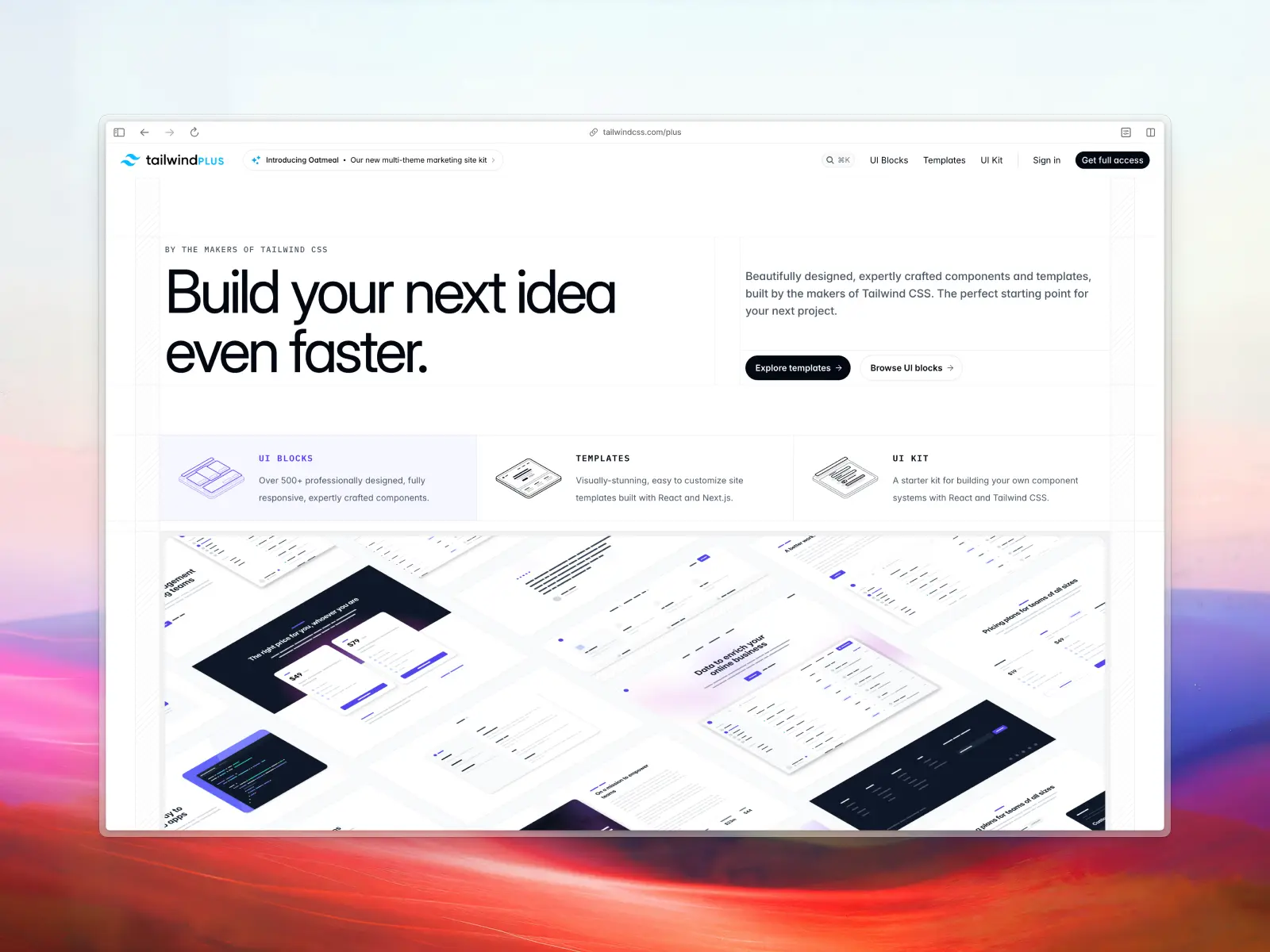
Tailwind Plus (previously Tailwind UI) is a premium, professionally-designed component library created by the makers of Tailwind CSS. It offers a vast collection of beautifully-crafted, production-ready components for HTML, React, and Vue that are fully responsive and highly customizable.
Similar to Untitled UI React and shadcn/ui, Tailwind Plus is not a traditional component library that you install as a dependency; instead, you get access to the code for each component, which you can then adapt to your project's specific needs.
Update: On September 9, 2026, Tailwind Labs announced it is joining Shopify, and Tailwind Plus closed to new customers the same day. Existing licenses still work, but you can no longer buy one—the product page now redirects straight to a login screen. Tailwind CSS itself is unaffected and stays MIT-licensed, as do Headless UI and Heroicons. If you were planning to buy Tailwind Plus, see our roundup of the best Tailwind Plus alternatives in 2026.
Tailwind Plus key features:
- Professionally designed components: A comprehensive collection of over 500 pre-built components, including marketing, application UI, and e-commerce UI elements.
- React, Vue, and HTML support: Provides code for popular frameworks, allowing for seamless integration.
- Fully responsive: Components are designed to look great on all screen sizes.
- Highly customizable: Built with Tailwind CSS, making it easy to tailor the components to your brand's styling, including dark mode.
- Accessibility-focused: Built with their in-house Headless UI library, ensuring components follow accessibility best practices out of the box.
- Catalyst included: Tailwind's own React UI kit shipped as part of a Tailwind Plus license, so it's behind the same closed door for new buyers.
Tailwind Plus pros:
- Great design quality: Tailwind Plus components are well-designed, modern, and up-to-date with design trends and best practices.
- Saves significant development time: Provides production-ready components, allowing you to build interfaces quickly.
- Excellent for prototyping and production: Suitable for both rapid prototyping and building full-fledged applications.
- Clear and well-structured code: The provided code is clean and easy to understand.
- Made by the Tailwind team: Nobody knew the framework better, and it showed in how idiomatic the markup was.
Tailwind Plus cons:
- No longer available to new customers: As of September 2026, Tailwind Plus is closed to new sign-ups. Existing customers keep access, but you can't buy it or even preview it.
- Uncertain future updates: With the team now focused on Tailwind CSS at Shopify, a product closed to new customers is unlikely to see many new components.
- Premium cost: Unlike many open-source libraries, Tailwind Plus was a fully paid product from $299.
- No centralized package management: Similar to shadcn/ui, updates to components need to be manually integrated.
- Learning curve for Tailwind CSS: To effectively customize components, a good understanding of Tailwind CSS is necessary.
- No Figma UI kit or library: There are some community-built Figma UI kits and design systems based on Tailwind Plus, but they generally fall short in terms of quality and keeping pace with updates. If your development process includes prototyping designs in Figma, keeping design and code in sync can be more challenging without a Figma UI kit or design library.
4. Kibo UI
kibo-ui.com — Open source · ★3.9k · npm: ~900/wk
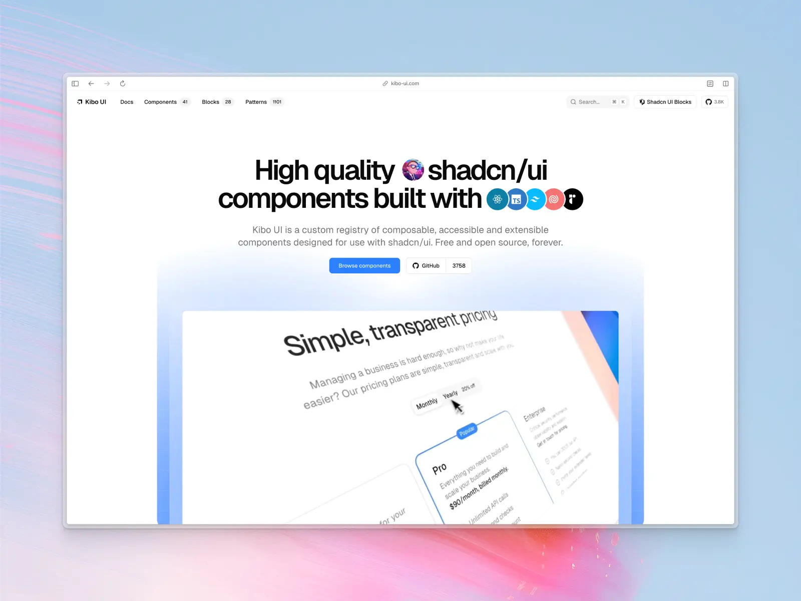
Kibo UI is a beautifully-designed custom registry of composable, accessible and extensible React UI components built by the talented Hayden Bleasel (@haydenbleasel). Unlike other React component libraries, Kibo UI is specifically designed to fill gaps in the shadcn/ui ecosystem, with niche and advanced components such as stories, reels, mini calendar, deck, and comparison. These can be easily added via the shadcn/ui registry.
Update: In October 2025, Shadcnblocks.com acquired Kibo UI from its creator. Per the acquisition announcement, Kibo UI remains fully open source and free on GitHub and the shadcn registry, with the new owner planning to add more components over time.
Kibo UI key features:
- Fully open source: All Kibo UI components are generously free and open source and can be found in their public GitHub repository.
- Great design quality: Components are well-designed, modern, and up-to-date with design trends and best practices.
- Accessibility best practices: Components follow accessibility best practices, including ARIA labels, keyboard navigation, and screen-reader compatibility. If a component provides interactive behavior, it’s implemented in line with accessibility standards (often leveraging Radix UI under the hood).
- Themeable: Kibo UI uses the same CSS variables approach as shadcn/ui, so components automatically adapt to light or dark themes with minimal effort.
- MCP support: Built-in Model Context Protocol (MCP) integration makes it easier to connect and extend UI components with modern AI tools.
Kibo UI pros:
- shadcn/ui registry support: If your project is already using shadcn/ui then you can easily integrate Kibo UI components via the shadcn/ui CLI.
- Focus on niche components: Offers specialized and uncommon UI components like stories, reels, and comparison blocks that most React libraries don’t include.
- AI-ready features: Built-in MCP support makes it one of the few libraries tailored for AI-driven workflows.
- Open source: Fully open source with flexible theming (including dark mode via CSS variables) and full code access.
Kibo UI cons:
- Not a full React component library: Unlike other React component libraries, Kibo UI isn't designed to include basic components such as buttons, inputs, textareas, charts, etc. For these, you will need to rely on another React UI library.
- Tied to your shadcn/ui base: Confirm a component matches your project's primitive layer (Base UI, Radix, or React Aria) before installing, or you may end up shipping two.
- No Figma UI kit or library: If your development process includes prototyping designs in Figma, keeping design and code in sync can be more challenging without a Figma UI kit or design library.
5. React Aria Components
react-spectrum.adobe.com — Open source · ★15.8k · npm: ~4.03M/wk
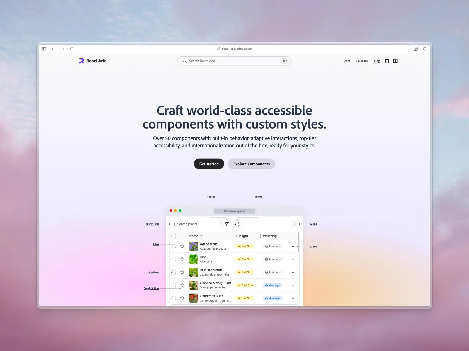
React Aria Components provide a library of unstyled UI components that focus on ARIA accessibility best practices and design patterns. Built on top of the React Aria hooks, this library delivers accessibility, internationalization, and interaction behaviors straight out of the box, allowing developers to focus on design and styling. This is especially useful for complex interactive patterns like date pickers, comboboxes, and calendars, which are notoriously difficult to make accessible from scratch.
React Aria is an excellent choice for development teams that want to build a completely custom React-based design system from the ground up while ensuring top-notch accessibility and performance.
React Aria Components key features:
- Fully open source: All React Aria Components are generously free and open source and can be found in their public GitHub repository.
- Unstyled by default: Gives you complete control over the appearance of your components and design system.
- Accessibility-first: Implements WAI-ARIA patterns and accessibility best practices to ensure components are accessible to all users.
- Behavior included: Handles focus management, keyboard navigation, and more with minimal effort.
- Internationalization support: Comes with built-in support for over 30 languages.
React Aria Components pros:
- Maximum design flexibility: The unstyled nature allows for complete customization to match any design system.
- Excellent developer experience: The API is well-designed and easy to use.
- Guaranteed accessibility: By handling the accessibility logic, it saves developers a significant amount of time and effort.
- High-quality interactions: Provides consistent and reliable user interactions across different devices and platforms.
React Aria Components cons:
- Requires manual styling: You are responsible for styling every aspect of the components.
- Steeper learning curve: Understanding how to style and compose the unstyled components can take time.
- More verbose: Can lead to more code compared to using a pre-styled component library.
6. Material UI (MUI components)
mui.com/material-ui — Open source + paid templates · ★98.4k · npm: ~10M/wk
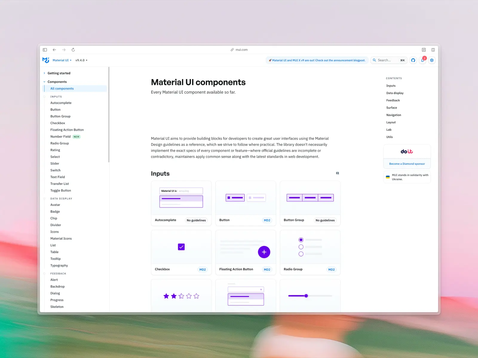
Material UI has been around for almost a decade and has helped thousands of teams to ship consistent user interfaces. Material UI is comprehensive and one of the most popular React component libraries, commonly used by large enterprise applications.
Material UI implements Google's Material Design system, providing a large set of semantic UI components that are ready for production use out of the box.
Material UI key features:
- Comprehensive component library: Offers a wide array of well-tested and documented MUI components.
- Material Design implementation: Adheres to Google's Material Design language, ensuring a familiar and intuitive user experience as well as accessibility standards.
- Extensive customization: Provides a powerful theming system that allows for deep customization to match your brand, including support for dark mode.
- Large and active community: Tens of thousands of GitHub stars with strong community support and extensive resources.
Material UI pros:
- Rich set of components: Covers a vast range of UI components, from simple buttons to complex data grids.
- Excellent documentation: Comprehensive and well-organized documentation with plenty of examples.
- Strong community support: A large community means it's easy to find solutions to problems and get help.
- Good for enterprise applications: Its robustness and scalability make it a solid choice for large-scale React projects.
Material UI cons:
- Opinionated, dated-feeling design: Material Design (first announced in 2014, making this one of the oldest React libraries on this list) might not suit every project, and can look dated without heavy customization. Like React Suite, Material UI's age means some patterns feel more dated than newer, actively-evolving libraries.
- Can be verbose and bundle-heavy: Customizing pre-built MUI components can lead to more verbose code and a larger bundle size if not managed carefully.
7. Reshaped
reshaped.so — Open source since Sep 2025 · ★2.2k
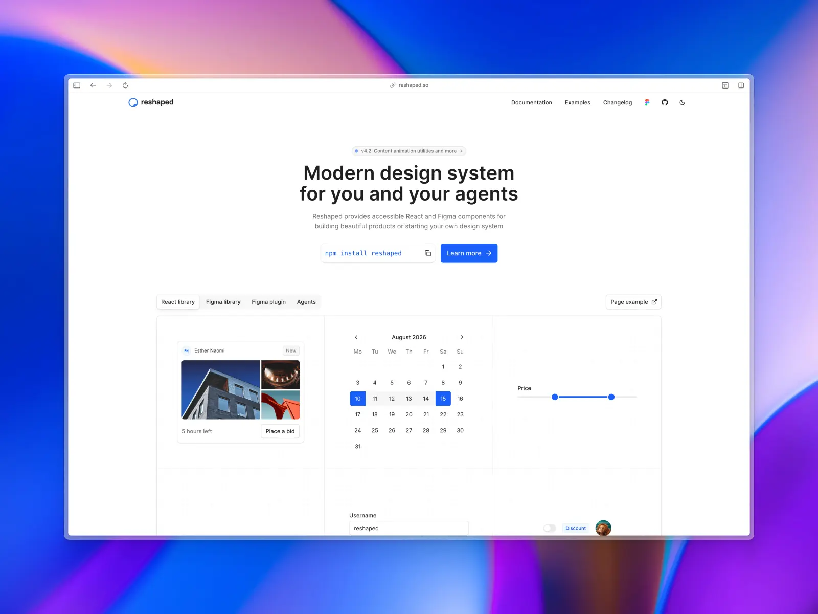
Reshaped is a professionally crafted React component library and design system. They provide core components you would need in every project, focusing on accessibility, component composition and development experience. Reshaped was created by Dima Belyaev (@blvdmitry), who honed his design systems knowledge at Booking.com and Shopify.
Reshaped key features:
- Fully open source: Reshaped recently open-sourced all their React components with flexible theming (including dark mode) and full code access
- Balanced and neutral design: UI components are well-designed, modern, and designed to be neutral for any design project or application.
- Figma plugin: A dedicated plugin syncs your code library with the latest Figma changes.
Reshaped pros:
- Detailed documentation: Comes with interactive examples, API references, and useful examples.
- Responsive styles: Adjust your styles based on viewport size with responsive syntax.
- No dependency lock-in: Reshaped uses React.js as the only runtime dependency. It doesn’t require you to install any CSS-in-JS library to start building React applications.
Reshaped cons:
- No marketing blocks: Reshaped components lean towards UI and product design and don't include React marketing website blocks or sections. This is not entirely a con, but it can be a disadvantage if you’re planning on building a marketing website.
- No matching icon library: While other component libraries like Untitled UI React and Tailwind Plus include popular icon libraries, Reshaped relies on third-party icon libraries.
8. AlignUI
alignui.com — Open source + paid from $299 · no public GitHub repo
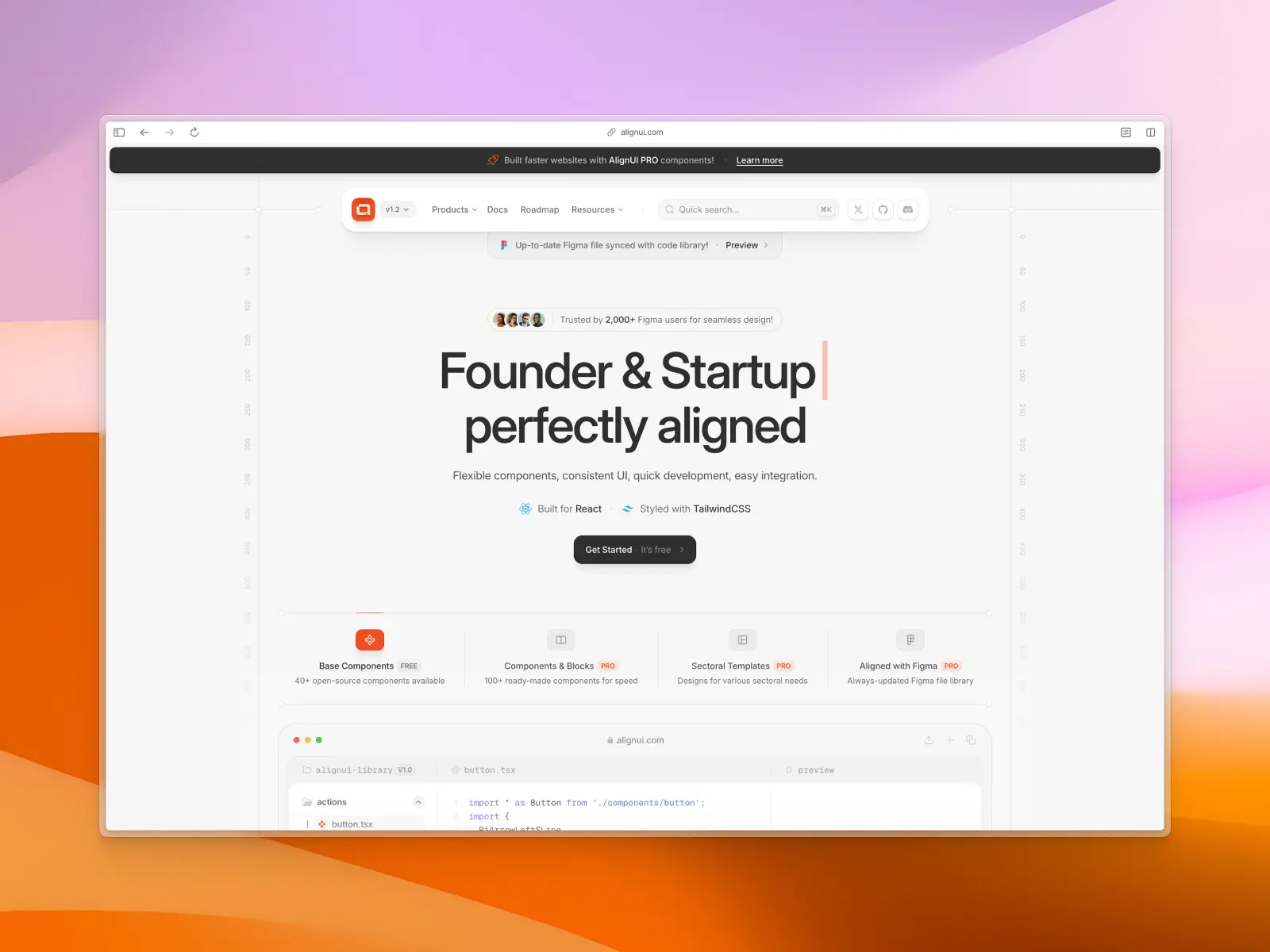
AlignUI is a Figma UI kit and React component library built with Radix UI (partially) and Tailwind CSS. It focuses on providing a comprehensive set of flexible and consistent UI components to accelerate the development process. AlignUI aims to perfectly "align" design and development workflows.
AlignUI key features:
- Comprehensive component library: Offers a wide range of 100+ flexible React UI components, plus 40+ free open-source “base” components.
- Built with React and Tailwind CSS: Provides a developer-friendly experience with a popular styling framework for easy customization.
- Figma and code in sync: Aims to provide a seamless workflow between designers and developers with a Figma UI kit.
- Free and PRO versions: Offers a set of 40+ free open-source "base" components with a more extensive PRO version available for purchase.
- Accessibility-focused: Designed to follow accessibility and WCAG best practices.
AlignUI pros:
- Rapid development: Aims for 10x faster development with ready-to-use components and pre-built templates.
- Highly customizable: AlignUI's design is world-class by default and designed to be flexible and customizable.
- Clean and maintainable code: Aims to reduce the amount of code needed, leading to cleaner projects.
- Seamless integration: Designed to drop into existing projects.
AlignUI cons:
- Newer library: As a more recent addition to the React UI library ecosystem, it has a smaller community and fewer resources available.
- PRO version for full access: Most React UI components and templates are part of the paid offering and not included for free.
- No public GitHub repository: The lack of a public GitHub repository can make it harder to freely browse the codebase and create and track issues.
- Based on Radix UI: Recently, the creators of Radix UI announced that this library isn’t being actively maintained as they have shifted their focus to Base UI, so projects built on Radix UI may face future compatibility issues or require migration to alternatives such as React Aria or Base UI.
- No matching icon library: While other component libraries like Untitled UI React and Tailwind Plus include popular icon libraries, AlignUI relies on a third-party icon library.
9. Base UI
base-ui.com — Open source · ★9.9k · npm: ~535k/wk
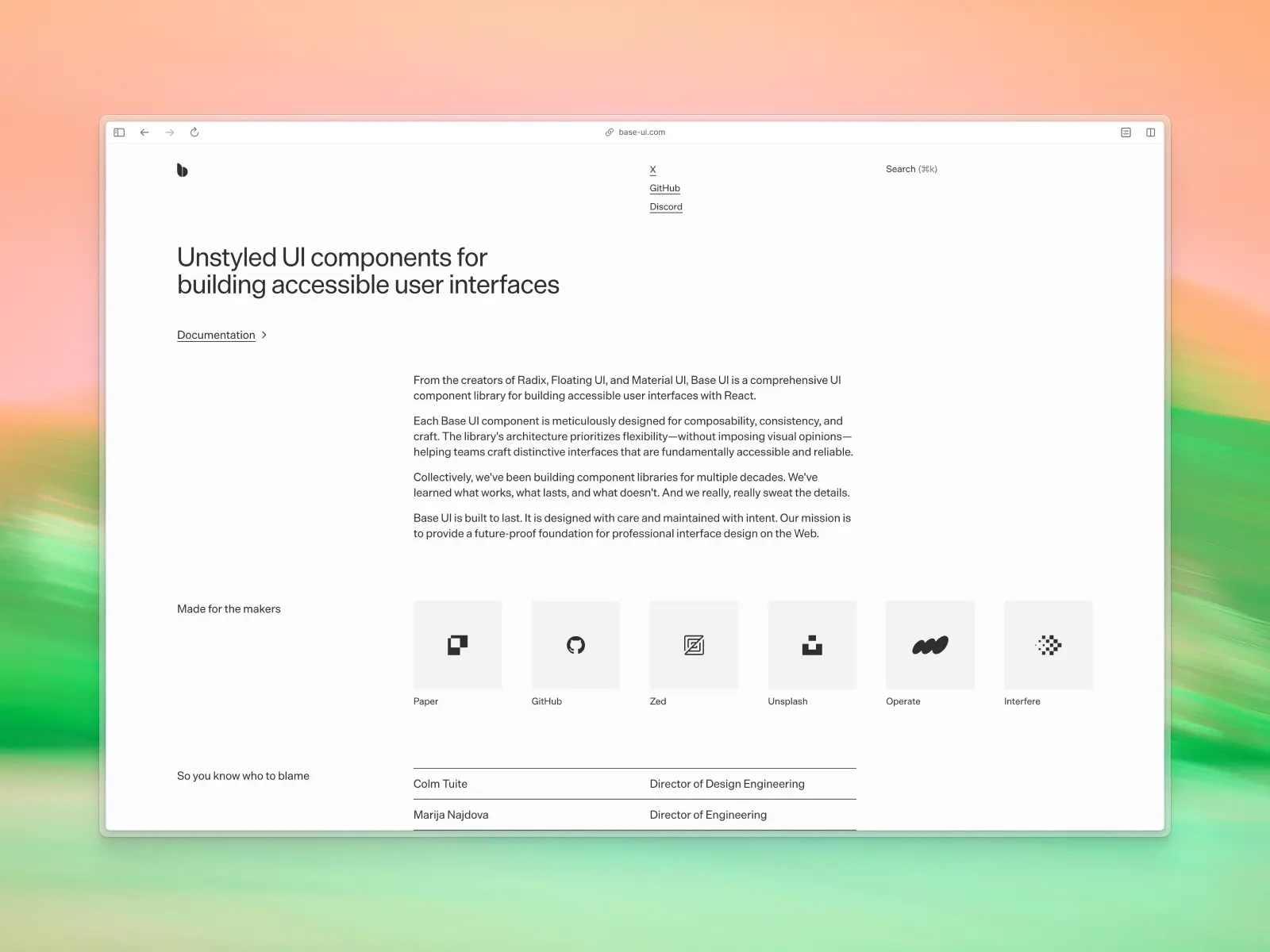
Base UI provides unstyled React UI components for building accessible web applications and design systems. Base UI has a very similar approach to React Aria Components and Radix UI, focusing on the core accessibility and behavior of the components so you can build on top of their primitives and style them to your specific needs. Base UI is built by the team behind Radix UI. Because it ships no styles at all, it also pairs cleanly with animation libraries like Framer Motion, since you're not fighting pre-baked CSS to add motion.
Base UI key features:
- Fully open source: All Base UI components are generously free and open source and can be found in their public GitHub repository.
- Unstyled components: Focus on what makes your app truly yours.
- Accessibility-focused approach: Designed to follow WCAG-compliant accessibility best practices out of the box.
- TypeScript support: Base UI is fully written in TypeScript, ensuring the best developer experience and scalability.
Base UI pros:
- Professional documentation: Comes with interactive examples, API references, and useful examples.
- Easy to style and theme: Designed to be easily adapted to your desired styles and dark mode styling via data attributes and other helpers.
- Performance-focused: Since each component comes with an isolated and separate NPM package, you won’t be downloading unnecessary React components and code.
Base UI cons:
- Smaller set of components: Base UI provides fewer React components compared to similar React UI component libraries like React Aria (although it is new and growing).
- Not initially styled: If you’re looking for ready-to-use React components, then Base UI might not be a good fit.
- Relatively new: Compared to other libraries, Base UI is relatively new, which could be concerning for some teams. However, community support has been extremely positive.
- Narrower alternative exists: If you want something even lighter, Headless UI (also from the Tailwind team) covers similar ground with a smaller component set.
10. Tailark
tailark.com — Open source + paid from $249 · ★2.3k
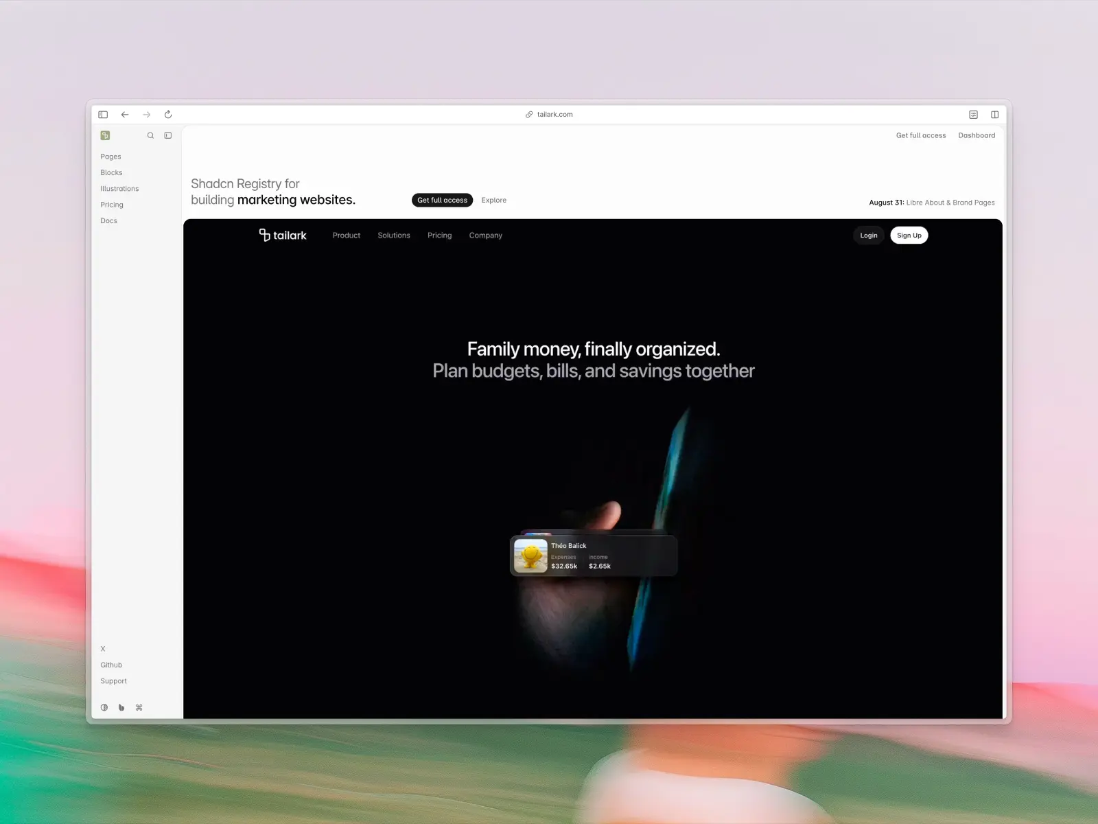
Tailark is a beautifully designed collection of marketing UI blocks and templates built on top of shadcn/ui. Despite being quite new, it delivers extremely high-quality, modern website components with a strong focus on design.
Tailark is a great fit if you’re looking to build a modern marketing website based on shadcn/ui, complete with pre-built sections and layouts.
Tailark key features:
- Partially open-source: A comprehensive collection of Tailark components is free and open source and can be found in their public GitHub repository. Premium components are available for purchase as part of their "Quartz" UI kit.
- Great design quality: Marketing website components and sections are well-designed, modern, and up-to-date with design trends and best practices.
Tailark pros:
- shadcn/ui registry support: If your project is already using shadcn/ui then you can easily integrate Tailark components via the shadcn/ui CLI.
- Modern and clean design: Crafted with attention to detail missing from other React libraries that focus on marketing website components.
- Generous free components: While partially paid, Tailark includes a generous amount of free marketing blocks and components available via their public GitHub repository.
Tailark cons:
- Not a full React component library: Unlike other React component libraries, Tailark is built specifically for marketing website components and isn't designed to include basic UI components such as buttons, inputs, textareas, charts, etc. For these, you will need to rely on another React UI component library.
- Tied to your shadcn/ui base: Confirm a component matches your project's primitive layer (Base UI, Radix, or React Aria) before installing, or you may end up shipping two.
- No Figma UI kit or library: If your development process includes prototyping designs in Figma, keeping design and code in sync can be more challenging without a Figma UI kit or design library.
11. HeroUI
heroui.com — Open source · ★30.6k · npm: ~536k/wk
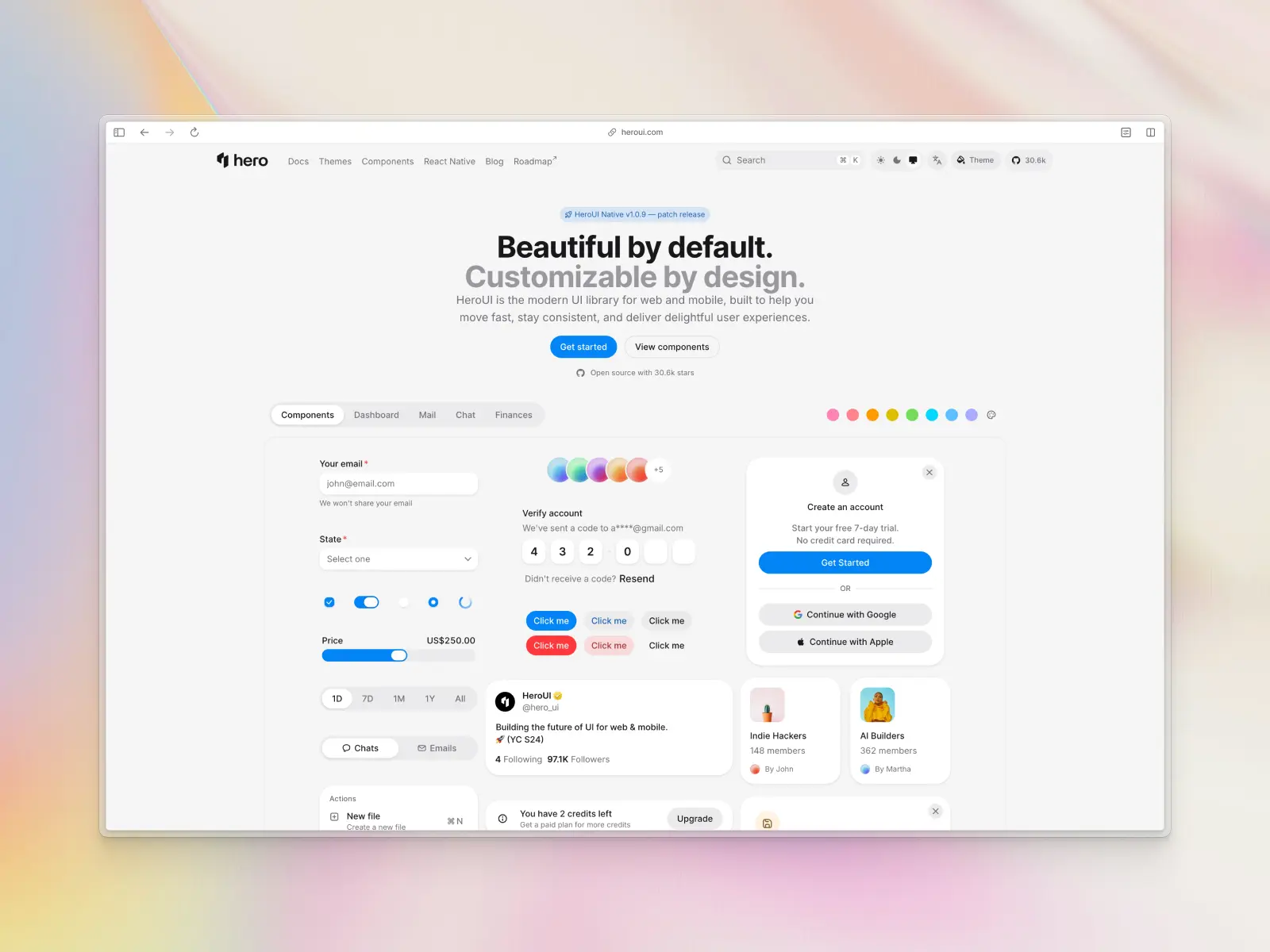
HeroUI (formerly NextUI) is a React UI library built on top of Tailwind CSS and React Aria. HeroUI is designed to be fast, accessible, and highly customizable.
This React library positions itself as a lightweight yet flexible solution for building React applications and websites with minimal setup. With a key focus on performance and accessibility, HeroUI is a popular choice for developers looking for a React library without the overhead of large and opinionated frameworks. Its GitHub stars have grown quickly since the rename from NextUI.
HeroUI key features:
- Built on Tailwind CSS and React Aria: Combines the styling power of Tailwind CSS with the accessibility features and best practices of React Aria.
- Themeable: Provides a plugin to customize default themes and dark mode.
- Fast and performant: Being built on Tailwind CSS means no runtime styles and a smaller bundle size.
HeroUI pros:
- Excellent developer experience: The API is well-designed and easy to use.
- Great performance: The use of Tailwind CSS ensures a performant and lightweight library for modern React applications.
- Good accessibility: Leverages React Aria to provide accessible components.
HeroUI cons:
- Smaller community: Being a newer library, the community is smaller compared to more established options.
- Fewer components: This React component library is still growing and may not have as many components as more mature libraries.
- Customization can be complex: While themeable, deep customization might require a good understanding of HeroUI's architecture.
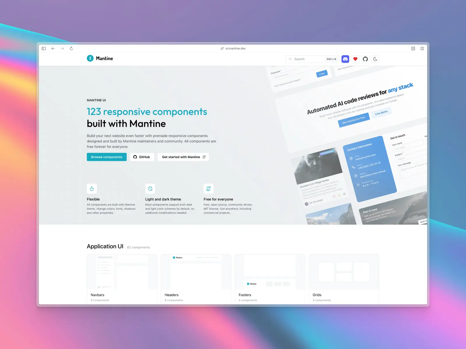
12. Mantine UI
ui.mantine.dev — Open source · ★31.6k · npm: ~2.55M/wk
Mantine UI is a React components library that offers a comprehensive collection of over 120 UI components and more than 70 hooks. Mantine UI is built with a focus on developer experience, accessibility best practices, and ease of use.
Mantine UI provides a powerful theming system for dark mode support and a wide range of components. It's a popular and versatile choice for building modern React web applications, and its GitHub stars have climbed steadily as more teams adopt it in production.
Mantine UI key features:
- Extensive component library: Includes over 120 responsive components for various use cases.
- Rich set of hooks: Offers a collection of useful hooks for managing state, UI, and more.
- Powerful theming system: Mantine UI's approach to theming allows for deep customization of colors, fonts, shadows, and other properties, including dark mode.
- Excellent documentation: The documentation is interactive and easy to follow, with live examples and strong community support.
Mantine UI pros:
- All-in-one solution: The combination of components and hooks provides a complete toolkit for building applications.
- Highly customizable: The theming system is powerful and flexible, making dark mode easy to implement.
- Great developer experience: The library is well-documented and easy to work with in React projects.
- Good performance: Focuses on providing good performance and best practices out of the box.
Mantine UI cons:
- Can be overwhelming: The large number of UI components and hooks within Mantine UI might be daunting for beginner users and developers.
- Smaller community compared to others: While growing, the community support is not as large as some of the more established React UI libraries.
- No predefined design system: Offers freedom but requires more design effort for a polished UI.
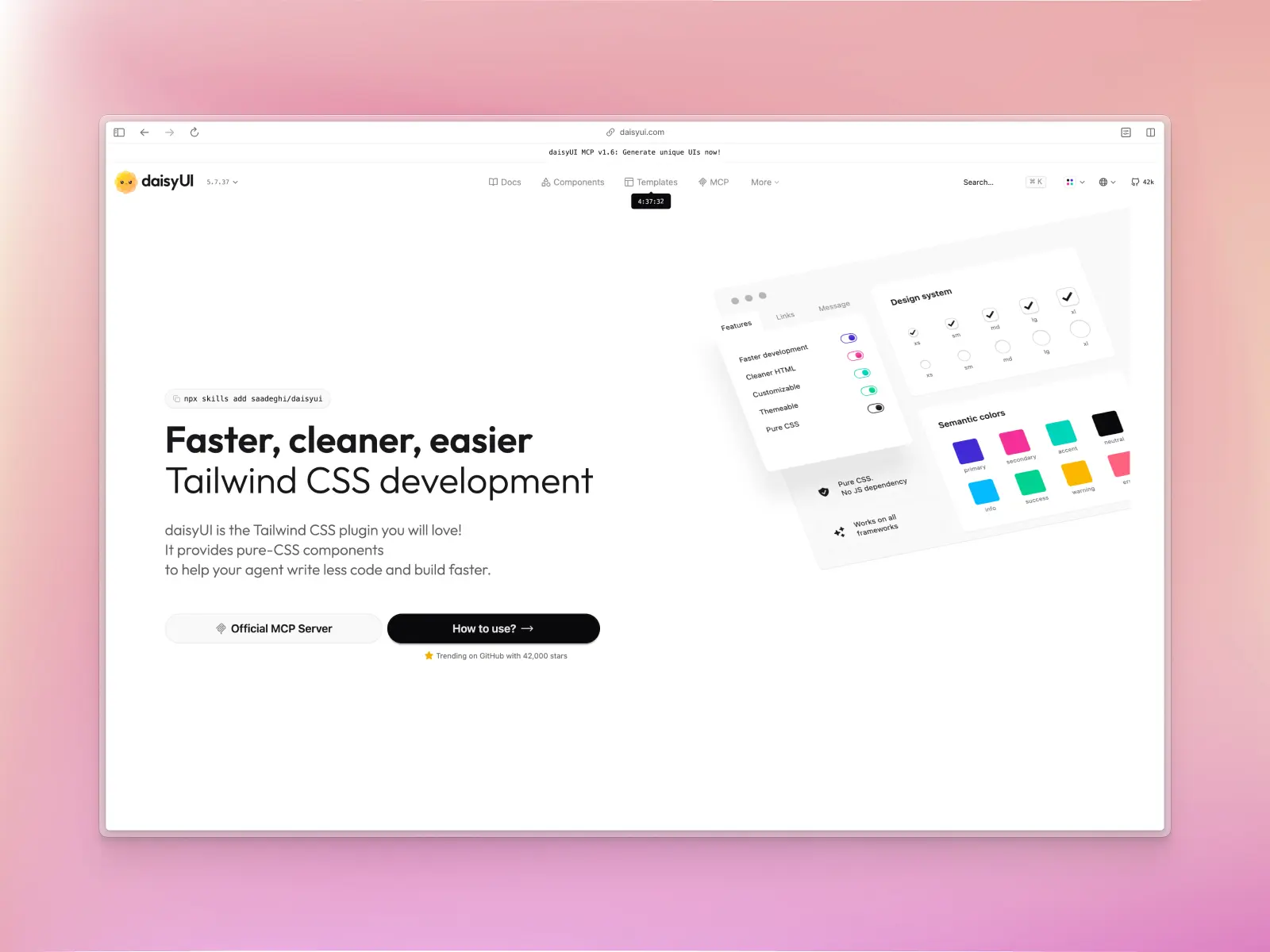
13. daisyUI
daisyui.com — Open source · ★42.3k · npm: ~984k/wk
daisyUI is a popular, free, and open-source Tailwind CSS and React component library. It extends Tailwind CSS by adding component class names, allowing you to write cleaner HTML and build beautiful user interfaces quickly. daisyUI is highly customizable and comes with a rich set of pre-designed themes.
daisyUI key features:
- Built on top of Tailwind CSS: Leverages the power of Tailwind while providing a component-based approach.
- Component-based classes: Uses semantic class names for UI elements and components, leading to cleaner and more readable HTML.
- Highly customizable and themeable: Comes with 35 built-in themes and allows for easy customization, including dark mode.
- Pure CSS with no JavaScript: The core of daisyUI is CSS-only, making it lightweight and performant, which can be a better user experience for small projects.
- Useful UI components: Comes with 68+ components and 600+ utility classes.
daisyUI pros:
- Clean and readable HTML: The use of component classes makes the markup much cleaner than using a long list of utility classes.
- Easy to theme: The theming system is powerful and easy-to-use.
- Lightweight and fast: Being CSS-only, it has a very small footprint.
- Great for rapid prototyping: Allows you to build good-looking interfaces very quickly.
daisyUI cons:
- Less granular control than pure Tailwind CSS: While customizable, it might not offer the same level of fine-grained control as using Tailwind CSS directly.
- Opinionated design: The default styles are somewhat opinionated, which might not suit every React project.
- Limited component logic: As it's primarily CSS-based, you'll need to implement your own JavaScript for complex component interactions.
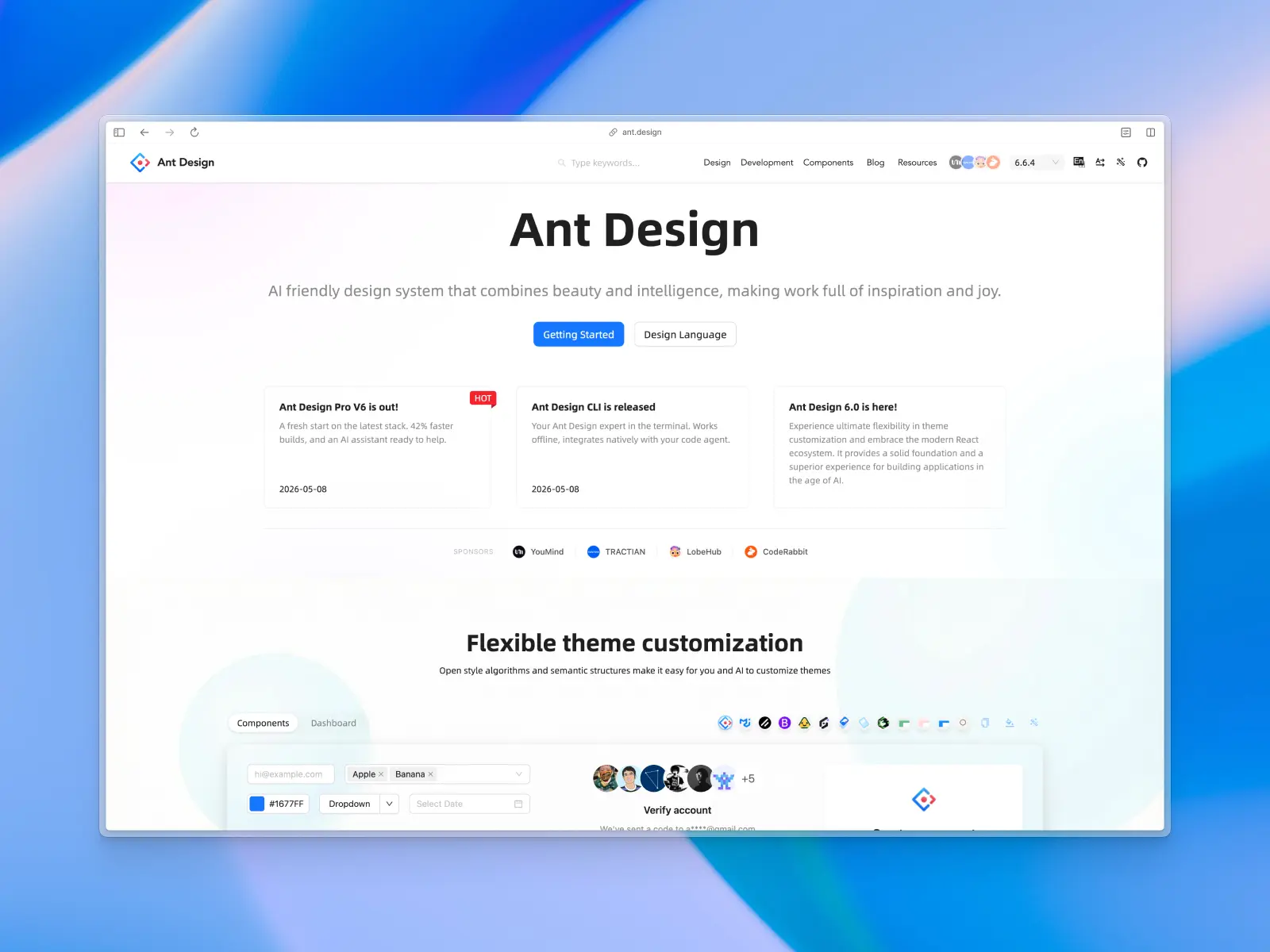
14. Ant Design
ant.design — Open source · ★99.3k · npm: ~3.7M/wk
Ant Design is an enterprise-class UI design language and React UI library. It provides a comprehensive set of high-quality components and design resources for building rich, interactive user interfaces. Ant Design was launched in July 2015, making it one of the oldest React libraries on this list. It has great community support with thousands of GitHub stars. Alongside Material UI and React Suite, it's one of the more established, enterprise-proven options on this list.
With a focus on data visualization and enterprise applications, Ant Design is a powerful tool for creating sophisticated and data-heavy React applications.
Ant Design key features:
- Enterprise-focused components: Offers a vast library of UI components designed for building complex React applications.
- High-quality design system: Provides a cohesive and polished design language with strong community support.
- Powerful theming: Allows for deep customization to match your brand's styling and dark mode support with minimal effort.
Ant Design pros:
- Comprehensive component library: A massive collection of UI components that covers a wide range of use cases, especially for enterprise applications.
- Excellent for data-driven applications: Strong support for data visualization and complex data tables.
- Well-documented: The documentation is thorough and provides clear examples.
Ant Design cons:
- Large bundle size: The comprehensive nature of this React UI library can result in a larger application bundle size.
- Opinionated, dated-feeling design and steep learning curve: The aesthetic is distinct and can feel dated, and the sheer number of components and options can overwhelm new users.
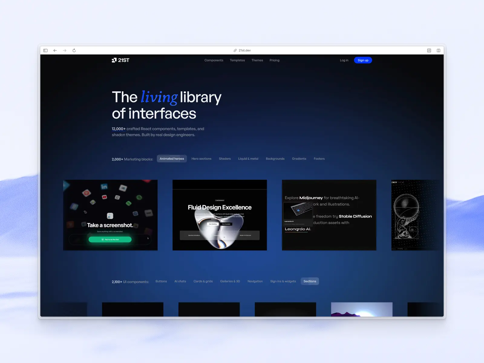
15. 21st.dev
21st.dev — Free to browse, paid Pro blocks · community registry, no single repo/star count
21st.dev isn’t a traditional component library; it’s a community-run registry of shadcn/ui-compatible components and blocks, installable via the shadcn/ui CLI just like an official registry. It’s become a go-to source for AI app builders (v0, Cursor, Lovable) generating shadcn/ui-based interfaces.
21st.dev key features:
- Community registry model: Thousands of components published by individual designers and developers, searchable by category.
- One-command install: Components install via the shadcn/ui CLI, landing in your project as owned code, not a dependency.
- AI-tool friendly: A popular source registry for AI-generated shadcn/ui interfaces.
21st.dev pros:
- Huge variety: Far more one-off blocks and styles than any single maintained library offers, and mostly free.
21st.dev cons:
- Inconsistent quality: Since anyone can publish, quality, accessibility, and maintenance vary widely between authors — not a cohesive design system.
Conclusion
Choosing a React UI component library in 2026 may not be about finding “the perfect” UI library. There's no single best React component library for every team — what works best for your development process may not work well for others. We suggest picking the right foundation for your team, existing tech stack, and timeline.
Many developers and teams combine one copy-paste library with a headless primitives library. If you’re building with AI coding tools, we’ve also compared the best component libraries for vibe coding. If you need a polished, scalable design system with great developer experience and real-world components, UI component libraries like Untitled UI React, shadcn/ui, and Mantine UI are a solid choice.
If you’re building a bespoke system from primitives, React Aria Components or Base UI give you maximum control. For marketing sites, Tailark can get you live fast with modern and clean design, and Tailwind Plus is still an option if you already hold a license. If you’re building an admin panel or analytics UI, our roundup of the best React dashboards covers ready-made options. Data-heavy and enterprise React applications may still lean on older React UI component libraries like MUI or Ant Design (just budget time for customization and bundle discipline).
A simple mental model:
- Want to copy+paste UI components with modern styling and accessibility best practices without runtime dependencies? Pick a copy+paste component library like Untitled UI React or shadcn/ui.
- Want design system primitives with full control to begin building custom design systems for your team? Choose React Aria Components or Base UI, or Headless UI.
- Need to ship a marketing site yesterday? Tailark looks great, or Tailwind Plus if you already own a license.
- Heavy data grids and enterprise applications? MUI or Ant Design, with careful design attention and code-splitting might be the best approach.
Whatever you choose, it's a great idea to test components before you commit to one or two libraries. Most React UI component libraries include free and open source components; install a handful of components and play around with using them in a project. Remember, these libraries are just building blocks — the real value comes from how thoughtfully your team assembles them into a finished product.
As we’ve mentioned, we’ll also be updating this blog post regularly with new React UI component libraries as they launch.
More best practice guides
This post is an excerpt from Untitled UI Figma, world's largest Figma UI kit and design system. Untitled UI includes tips and best practices right in the Figma file to help you level up as a designer. You can preview Untitled UI Figma here.
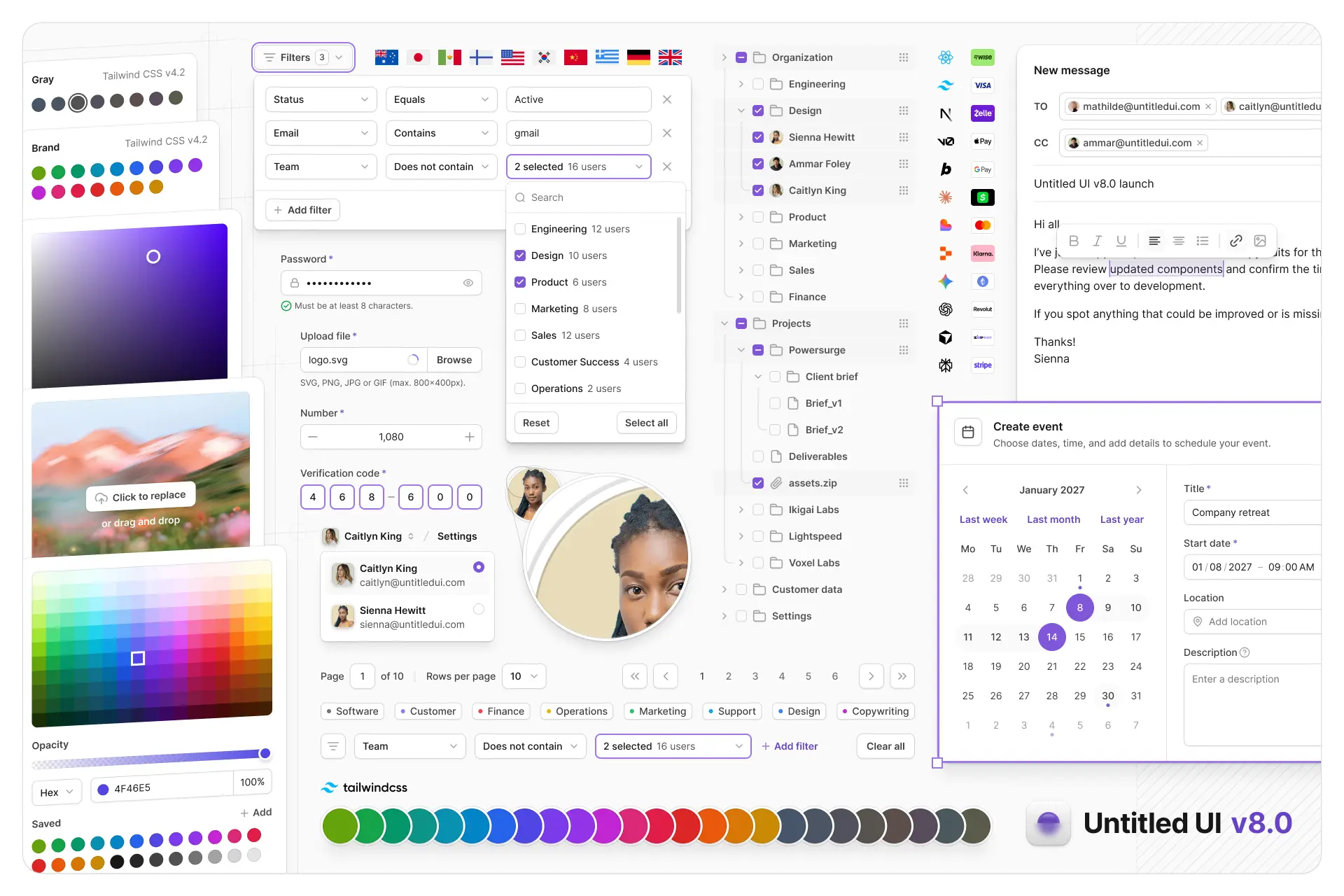
Untitled UI Figma is meticulously crafted with 100% Auto Layout 5.0, super-smart variants, Figma's newest variables features, and with accessibility in mind.
It's a great example of Figma design system best practices and is the most popular and highest-rated Figma UI kit on the internet with 3,650+ 5-star reviews!
We've also released Untitled UI Figma PRO LITE, which is a premium and lightweight version of the full Untitled UI Figma PRO STYLES kit and have included it for free. It's 55% lighter, faster, and is designed to include everything you need and nothing you don't. It's perfect for moving fast and for smaller projects!
Untitled UI was designed to be the "ultimate" UI kit and the perfect starting point for any kind of project—from beautiful marketing landing pages, all the way to complex dashboards and web apps—Untitled UI has thought of absolutely everything so you don't have to.
We're constantly making updates and improvements to the UI kit and recently announced that we've completely refactored Untitled UI to take advantage of Figma's latest features released at Config 2023, Framework 2024, Config 2024, Config 2025, and Config 2026. This includes all the latest Figma features such as color variables (dark mode), spacing, radius, typography, and effects variables, Auto Layout 5.0, min/max widths, Auto Layout wrapping, and much more.
You can check out a full preview of the design kit, or check out the 100% free UI kit here (which is more advanced than most UI kits in its own right!). If you're short on time, here's a 60-second overview: